Costco UI redesign
Redesigning to impove user experience of discovering and purchasing items, along with the new membership sign-up flow on Costco's mobile app, based on Usability Heuristics for UI design.
Project Highlights
Role UX Designer, UI Designer in a Team of 3
Project length 2 weeks
Tools Figma, Sketch, Invision, Photoshop
The problem space
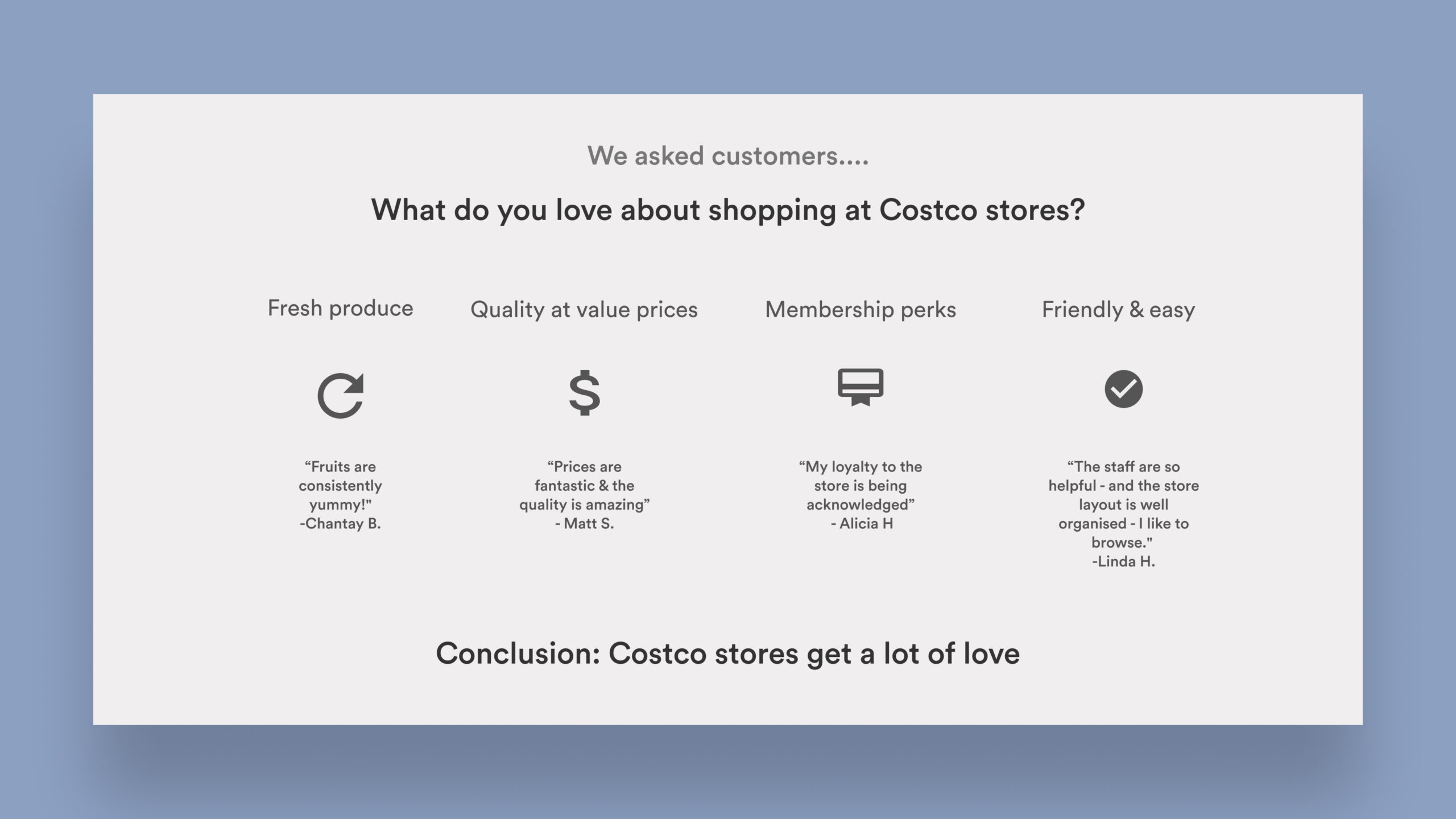
Insights from Costco's customer experience
Secondary research attempting to understand Costco's customer experience on their iOS and Android app revealed the motivations, pain points and behaviours of Costco's customers. There was a strong positive response to the Costco in-store experience with the top insights as follows-
• Great Value
• Quality produce
• Membership perks
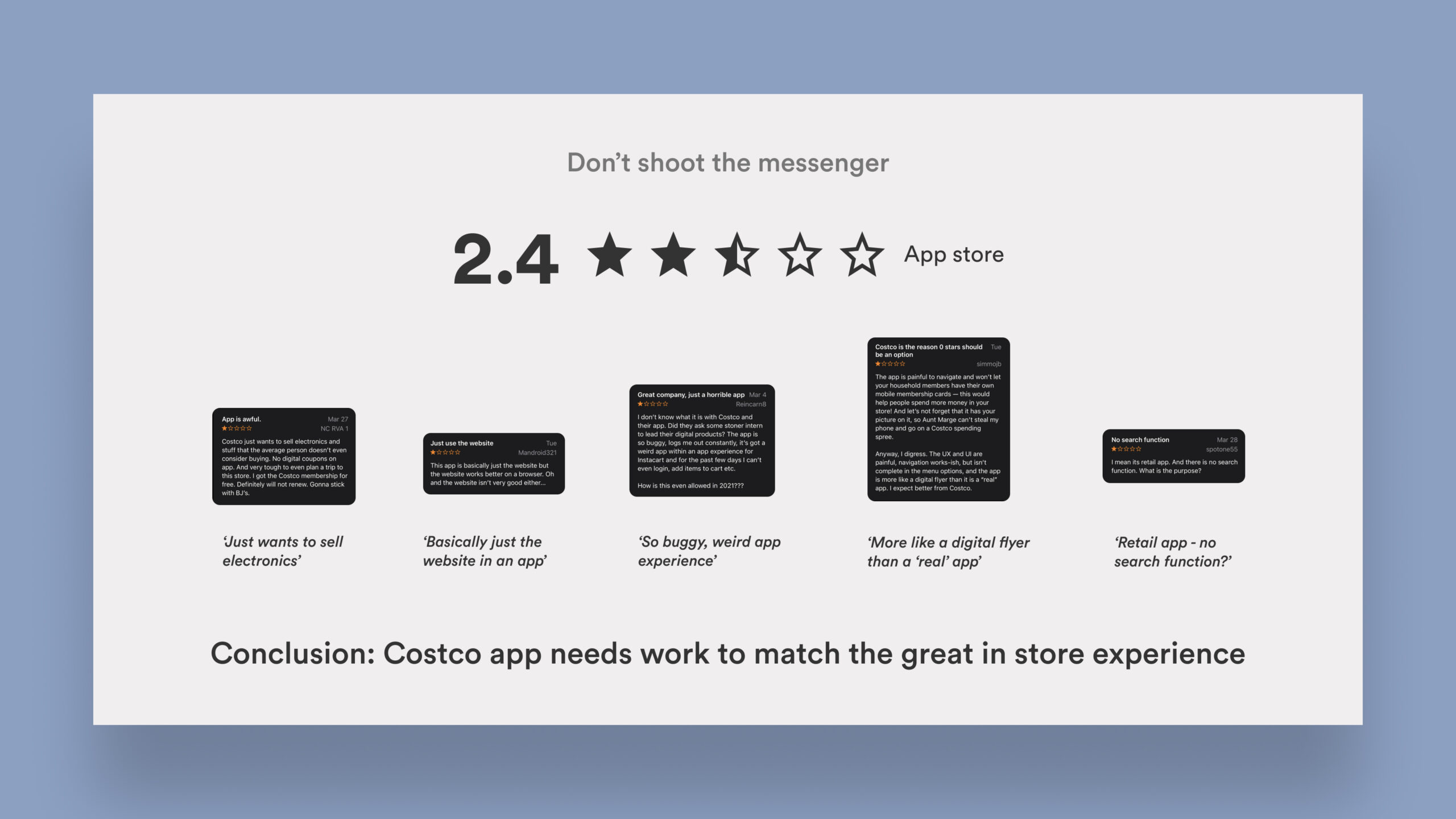
However, when it came to the mobile app, the app store reviews showed frustrated & negative response to Costco mobile experience-
• More like a website than an app
• Cluttered & overwhelming
• Expected more from Costco - brand expectations not met
Owing to the pandemic, 45% North American shoppers get grocery delivery online, and business will continue to stay online even after. Major food retailers are thus opting for mobile-first solutions to increase their sales and many new players like Amazon, Uber Eats and Deliveroo are incorporating groceries. Costco app's improved usability could certainly have major positive impact on their sales and new customer engagement and retention.
How Might We
improve the end-to-end customer journey and
increase memberships on Costco's iOS app?
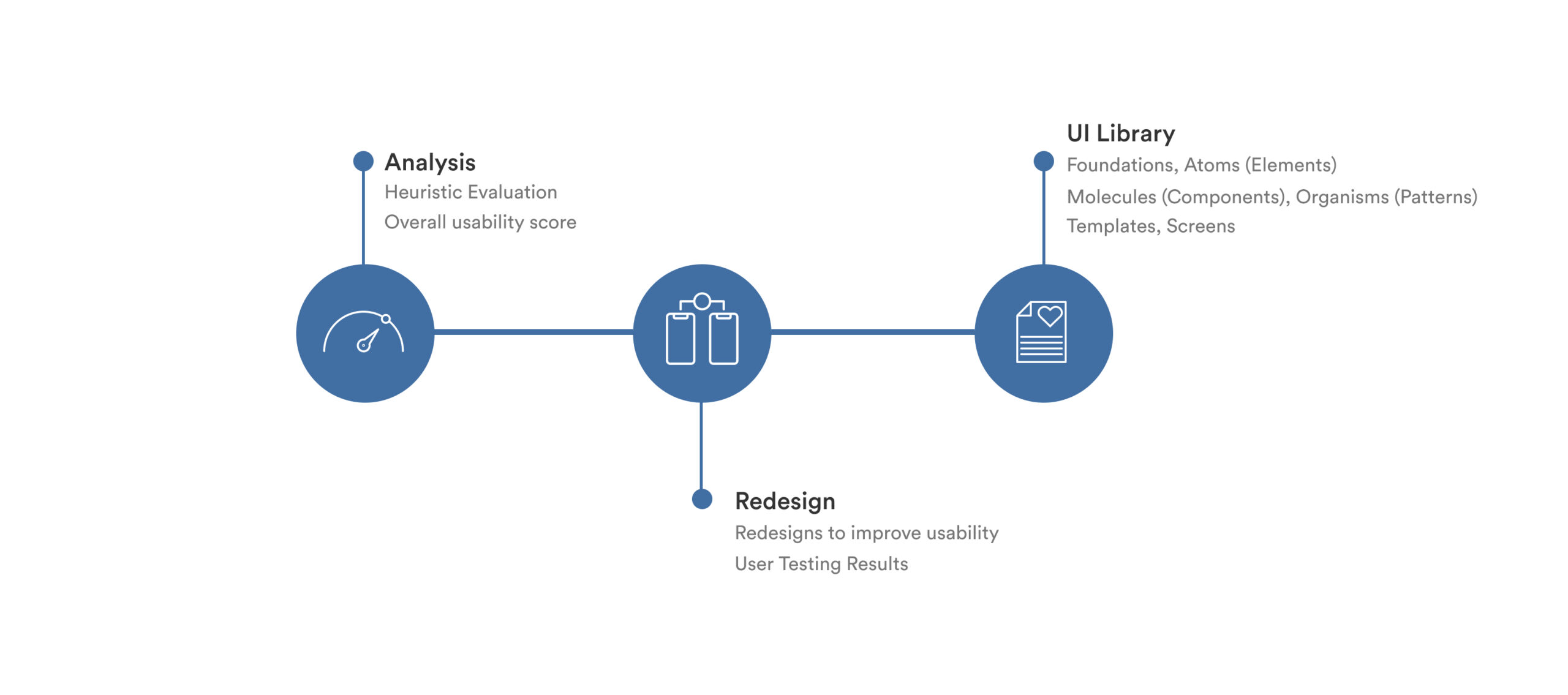
Design process
Heuristic Analysis and Redesign Process
We followed the design thinking process to ensure that the decisions for the redesigns were rooted in research and analysis. Thus we conducted an end-to-end heuristic analysis for the task flow of purchasing items and signing up as a new member on Costco's app.
Heuristic Analysis
Assessing Usability
What is a heuristic evaluation?
A heuristic evaluation is the process for auditing a digital experience and assessing its usability quantitatively. By using the general framework of the 10 principles of UI design from Nielsen Normal Group, we can utilize a standardized rule of thumb to provide clear areas of improvement. The goal is to spot areas needing improvement so that we can enhance the overall user experience.
The evaluation process followed these key steps -
• Consider key tasks that users should be able to easily perform
• Evaluate these task flows against usability heuristics
• Assign a severity rating for the user actions
• Provide recomendations on how to improve the usability
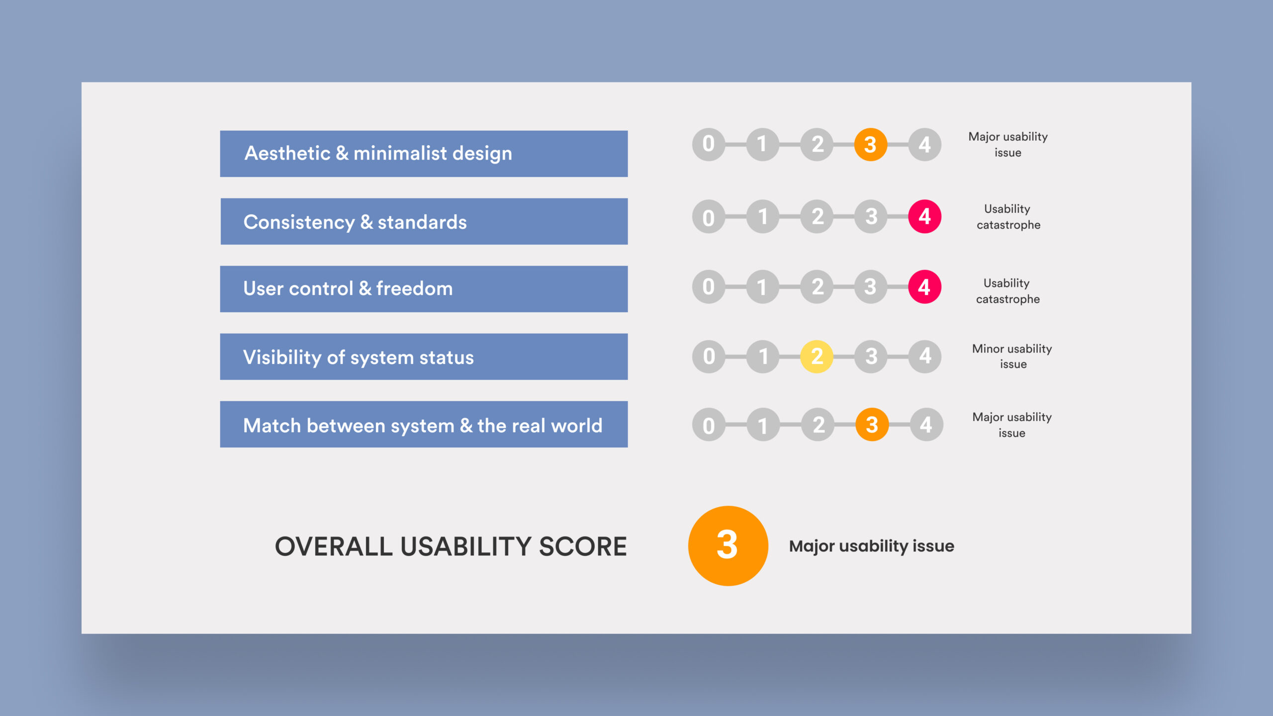
We assess any violations in the design by giving it a score rating on a scale from 0 to 4. These scores are provided based on three key factors of the violation. At the end, we also provide an average rating to assess the overall market impact of these ratings.
Frequency - is the problem common or rare?
Impact - is it easy to overcome the problem?
Persistance - will the problem repeatedly be an issue?
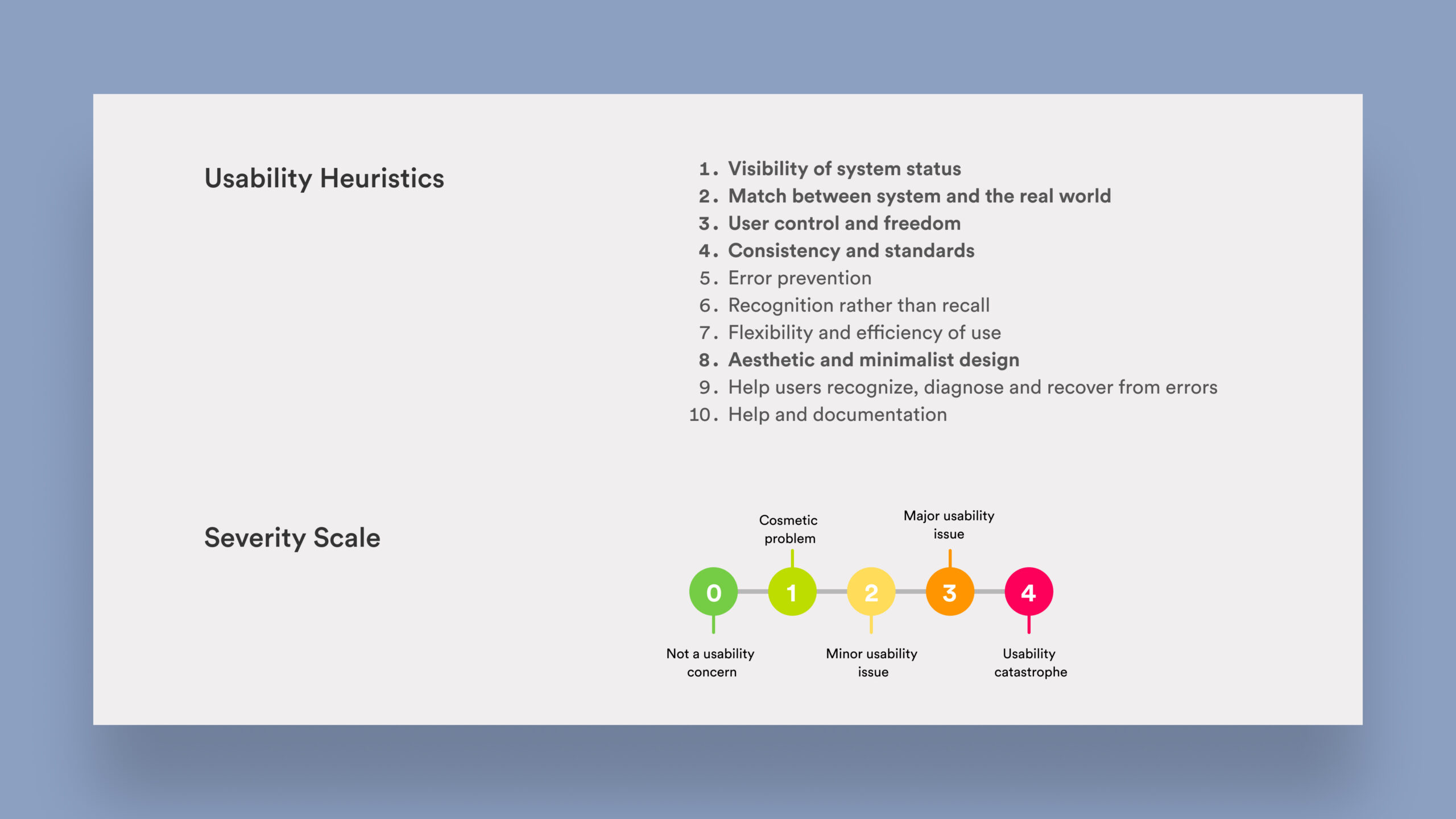
Usability Heuristics by Jakob Nielson and Severity Scale
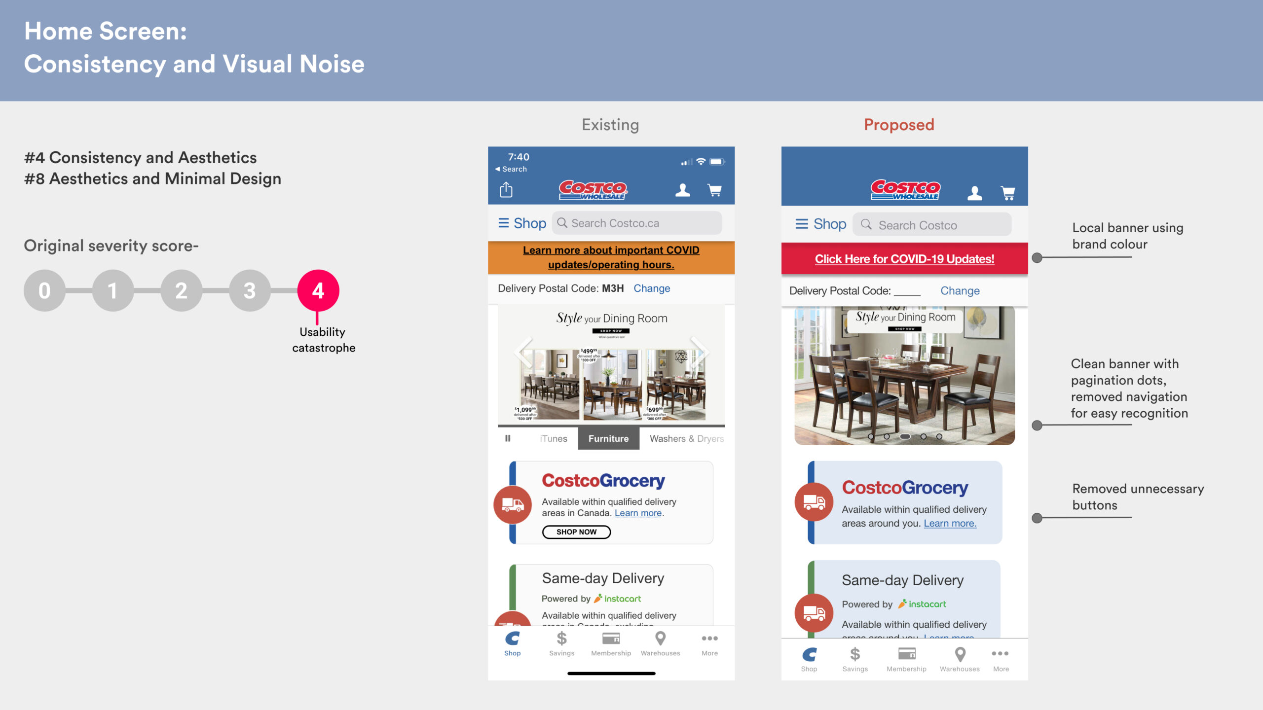
The highlighted Heuristic Principles were found to be most violated in Costco's usability analysis.
Analysis Highlights
Costco's usability evaluation overview
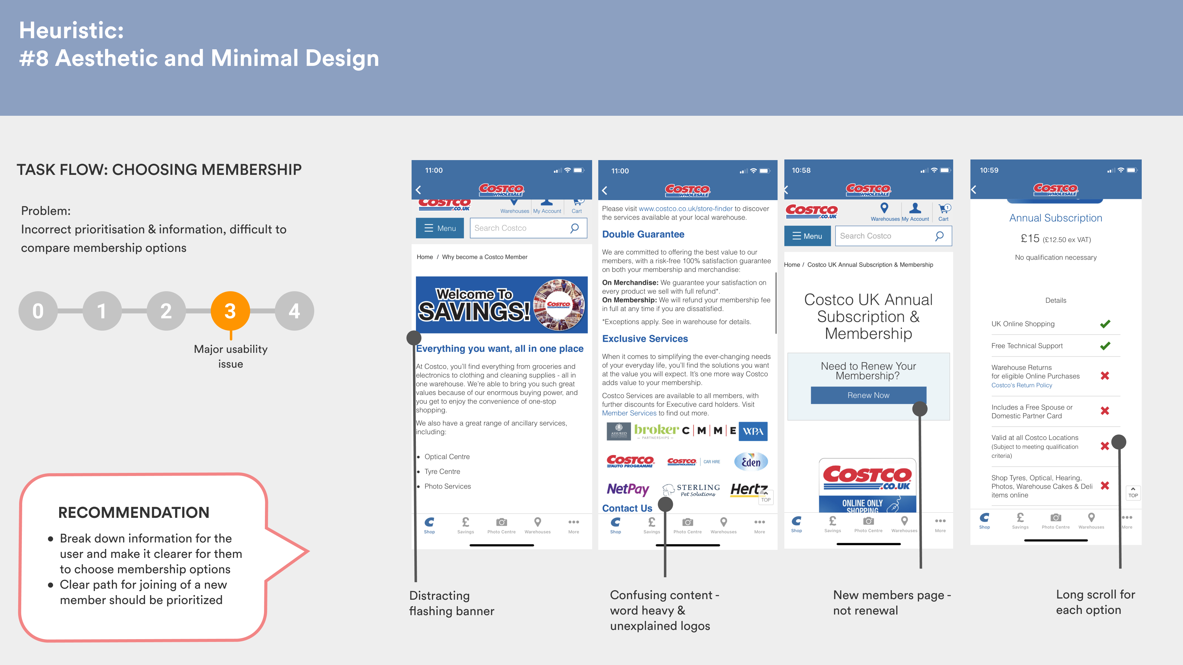
Based on a simple task flow of discovering items and groceries from the Shop screen, filtering items, adding to cart and signing up as new member, we tested the app for usability. Based on our assumptions, we created a proto-persona, Liza, who wants to add these items to cart and checkout as a new Costco member.
Along the flow, we found 5/10 heuristic violations which were -
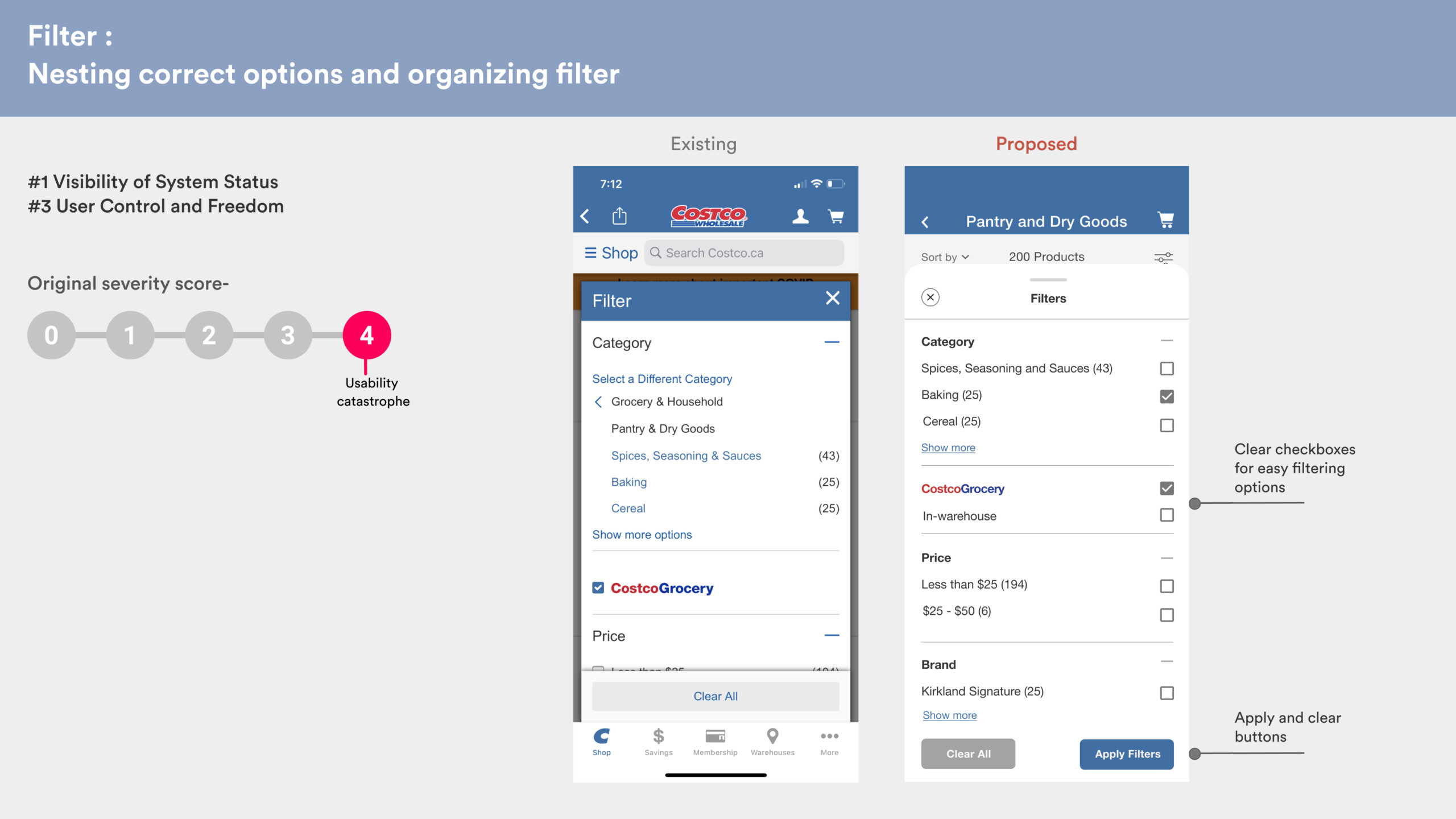
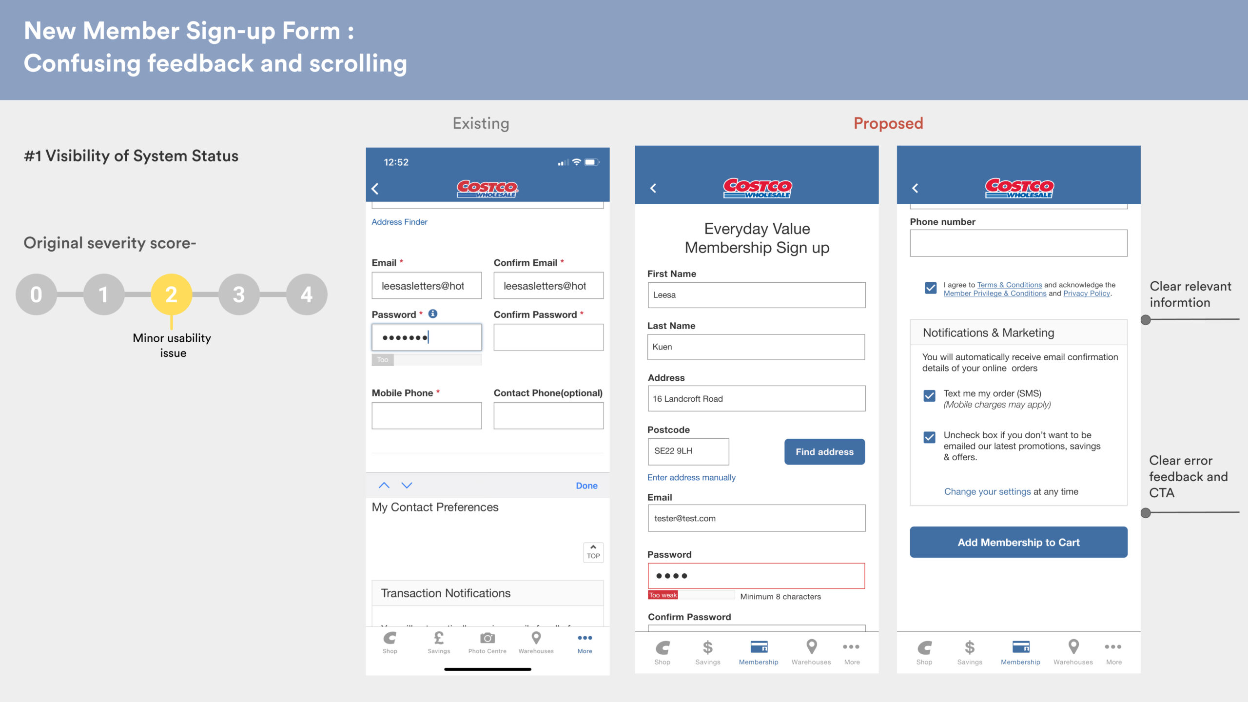
1. Visibility of system status
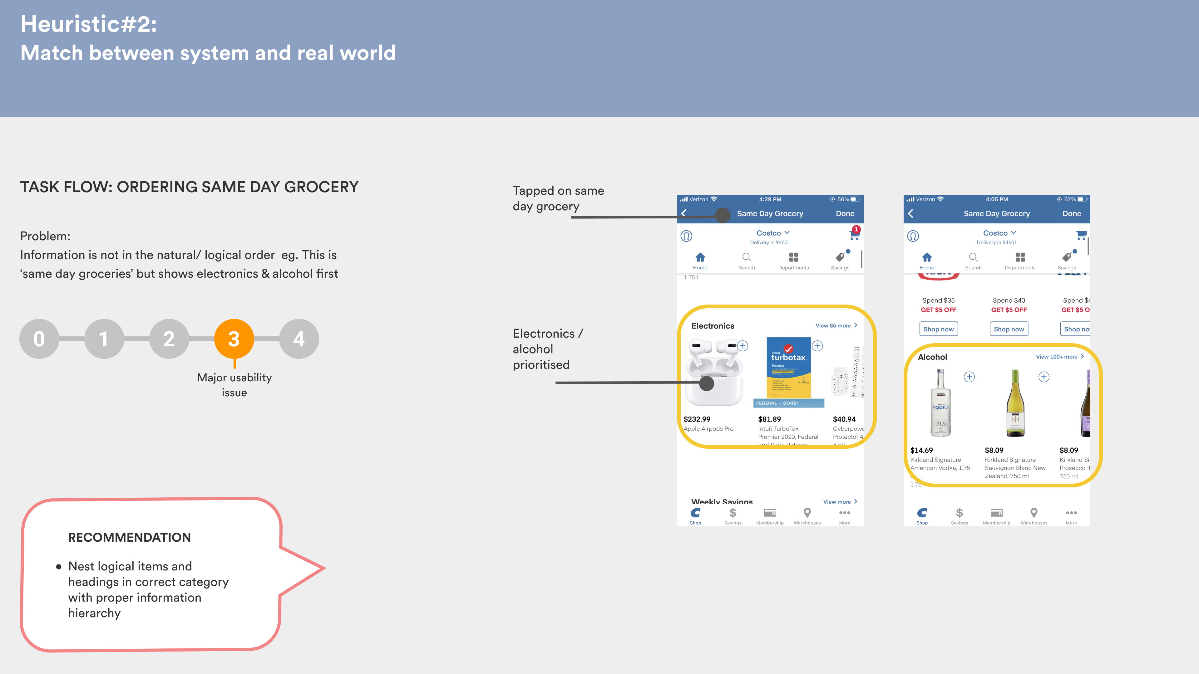
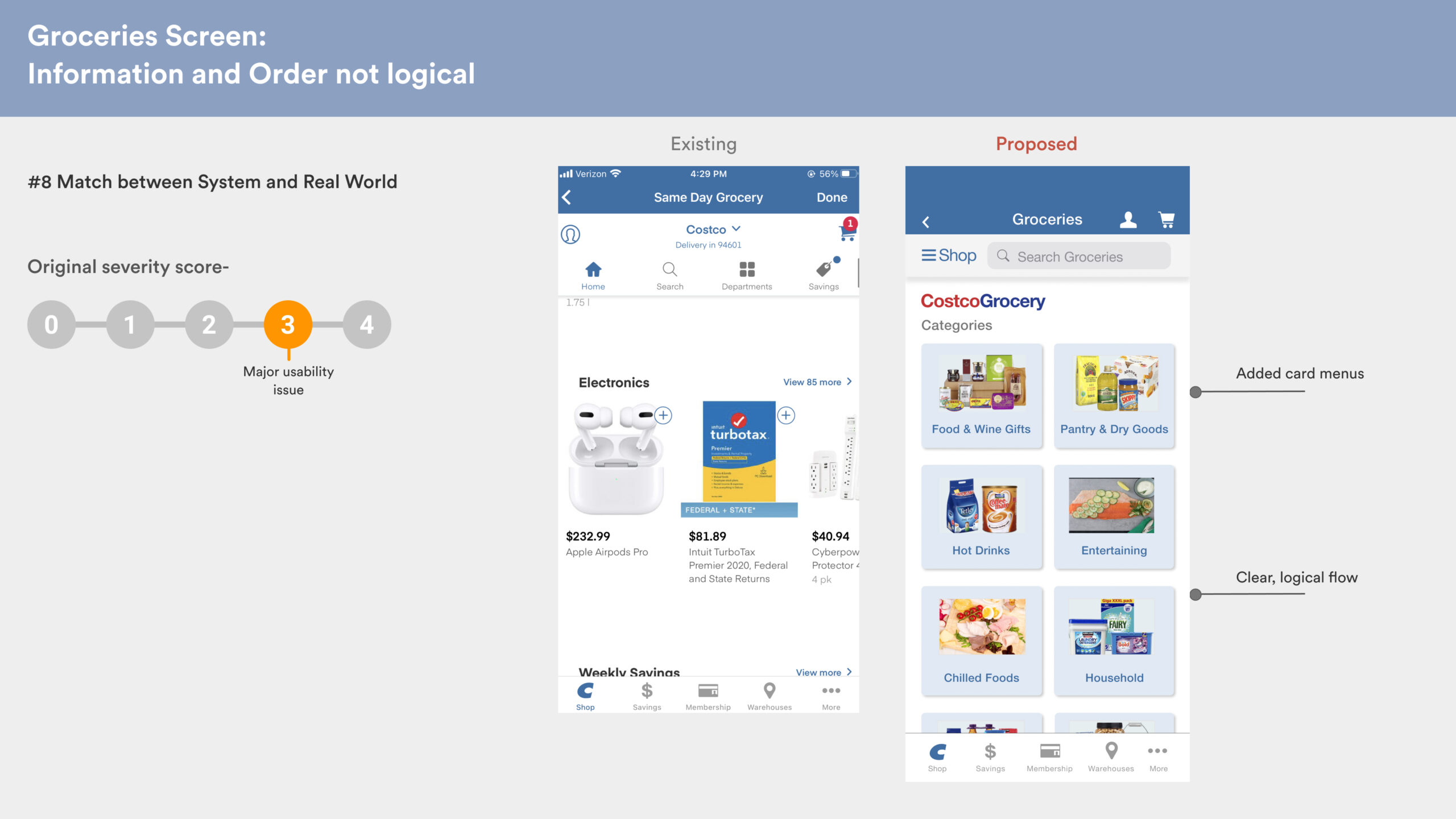
2. Match between system and real world
3. User Control and freedom
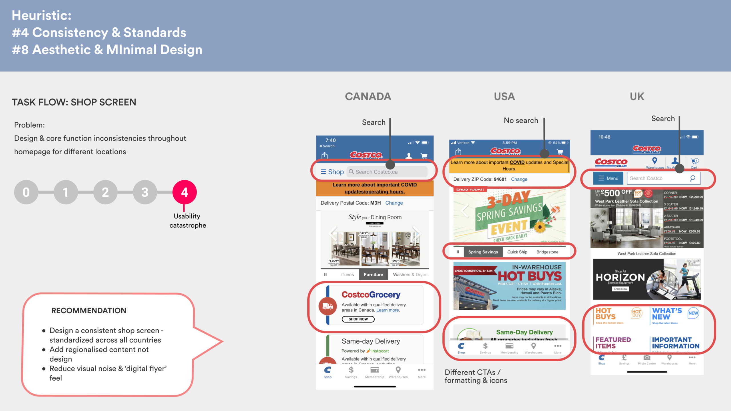
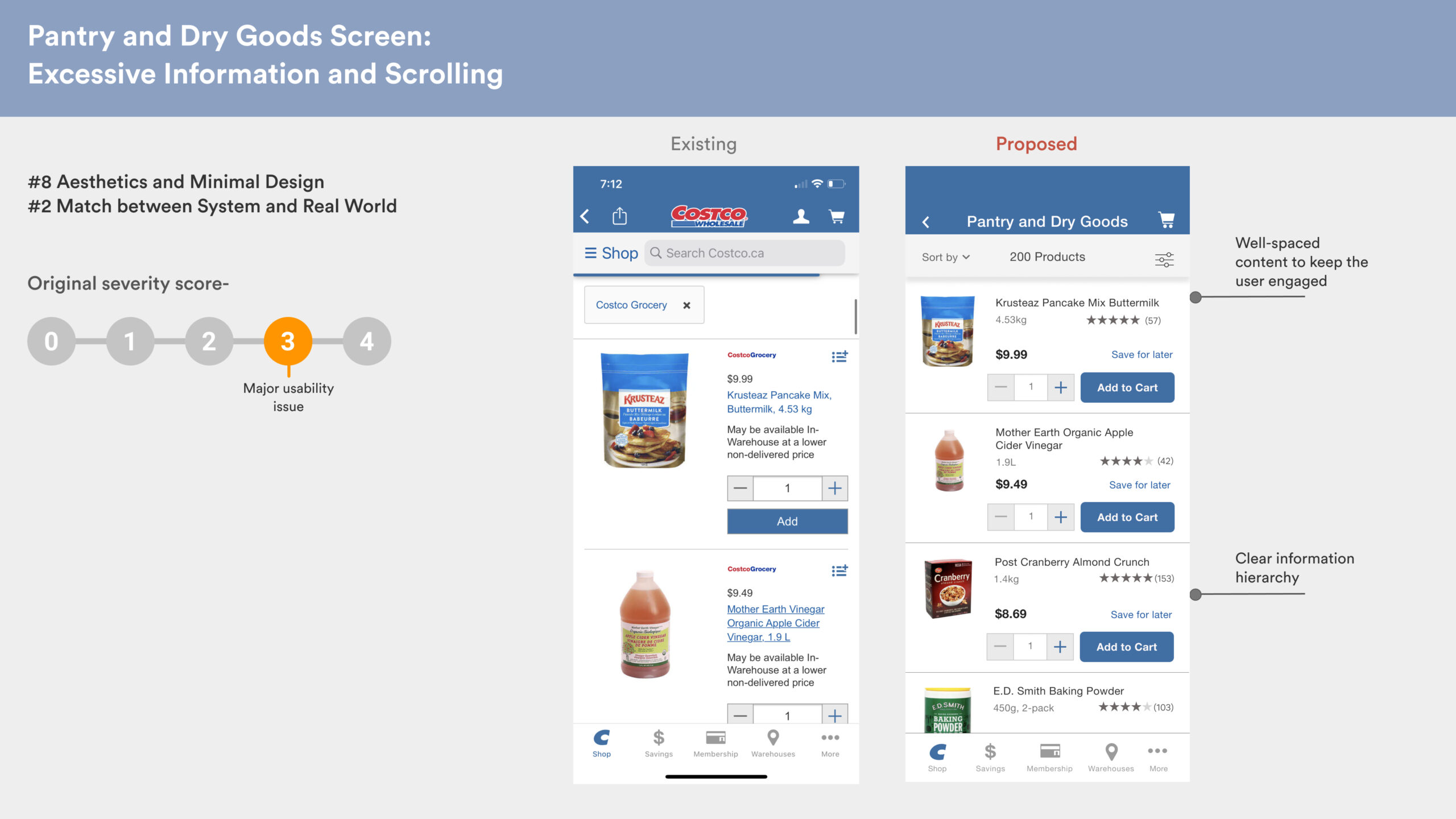
4. Consistency and standards
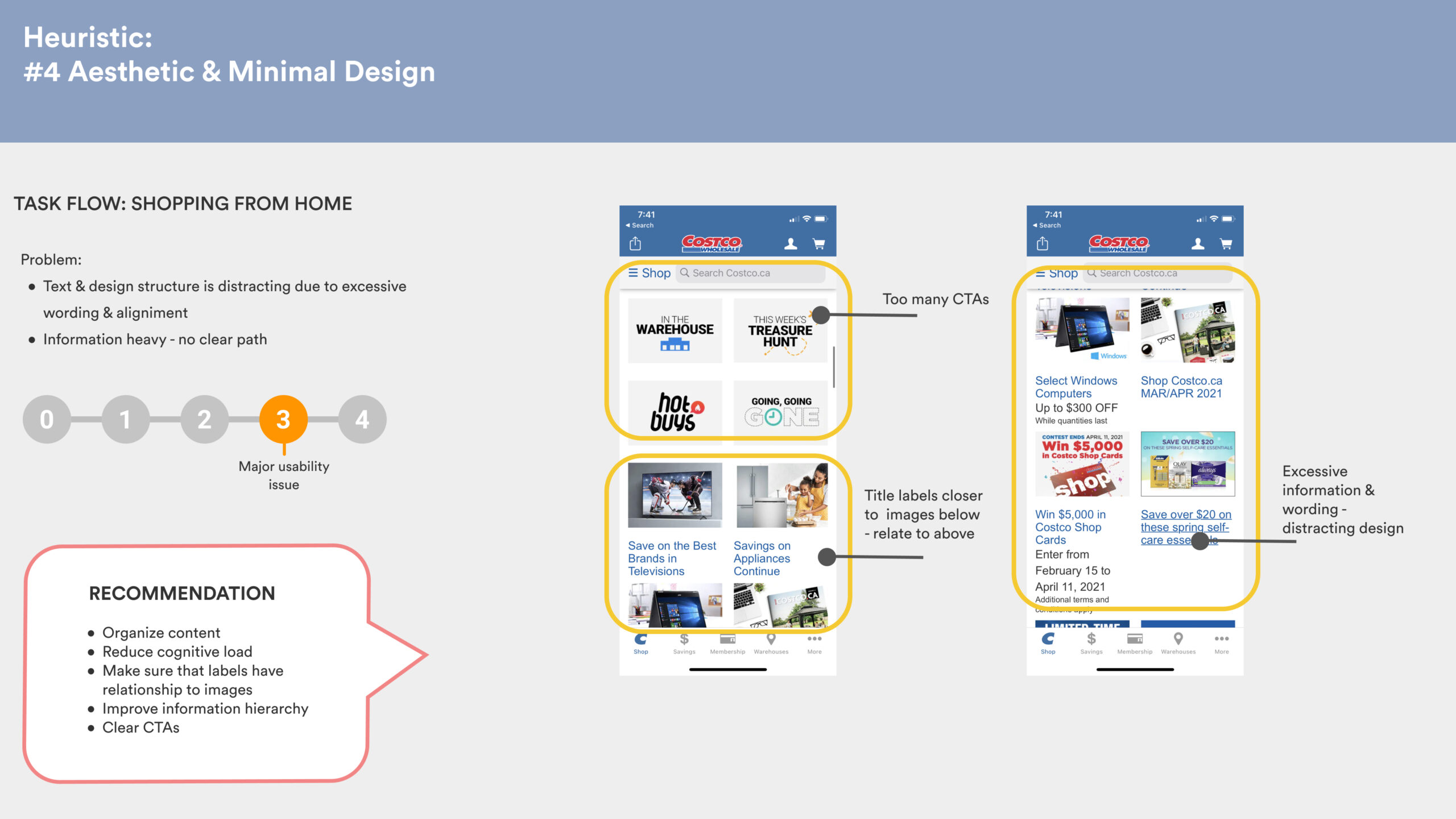
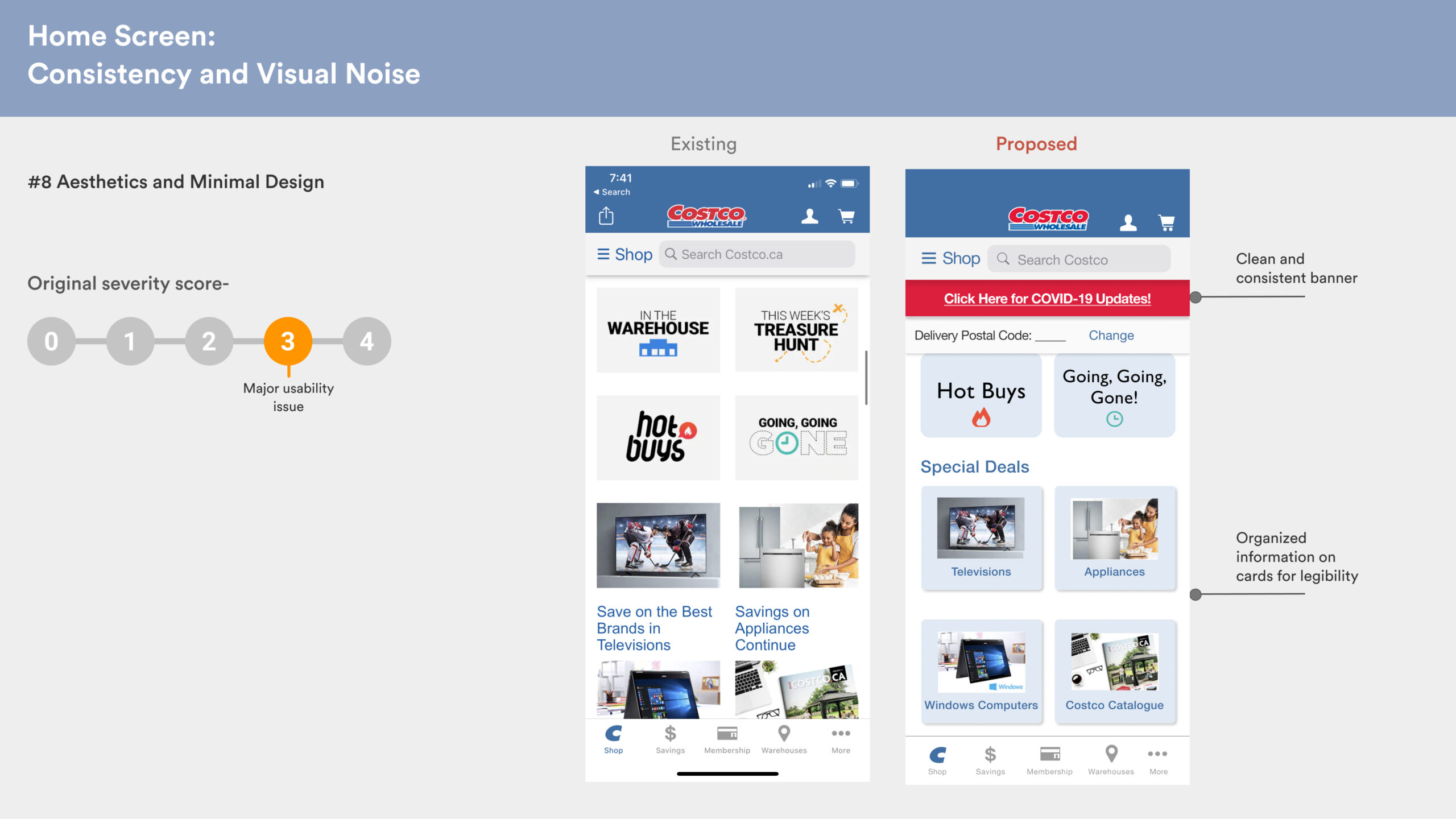
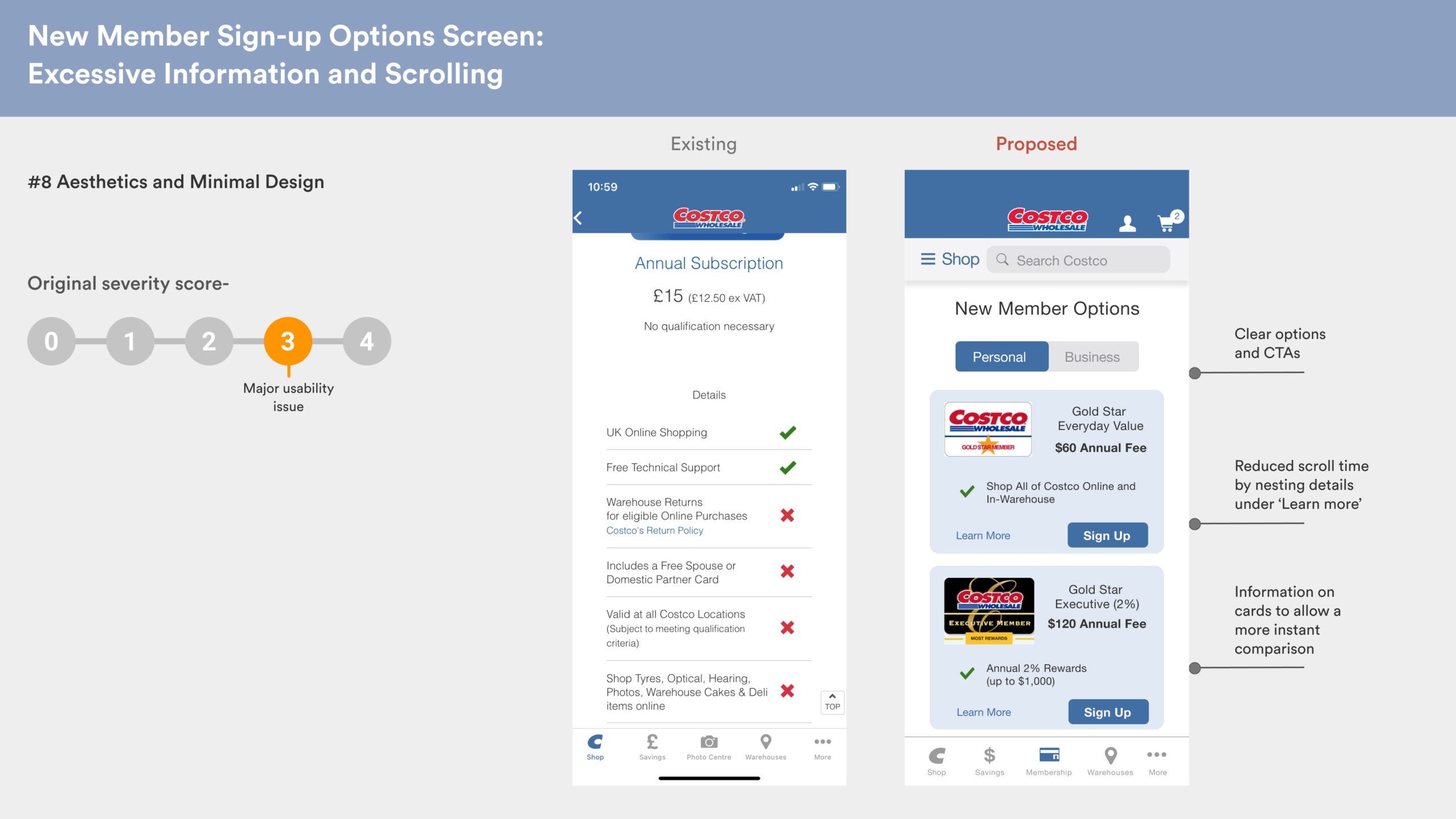
5. Aesthetic and minimal design
Recommendations were offered for each of these pages, which were then revisited during the redesign stage.
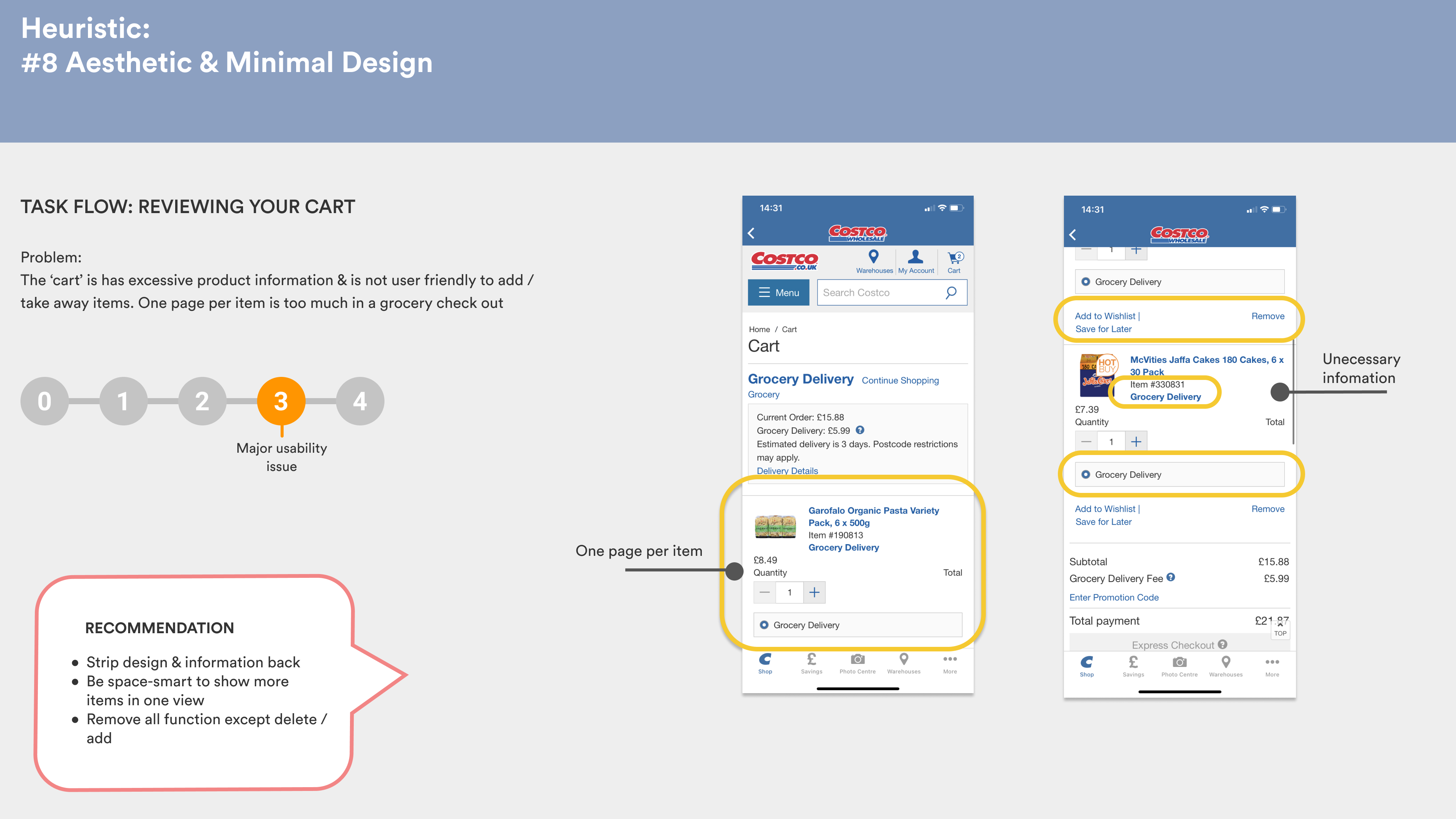
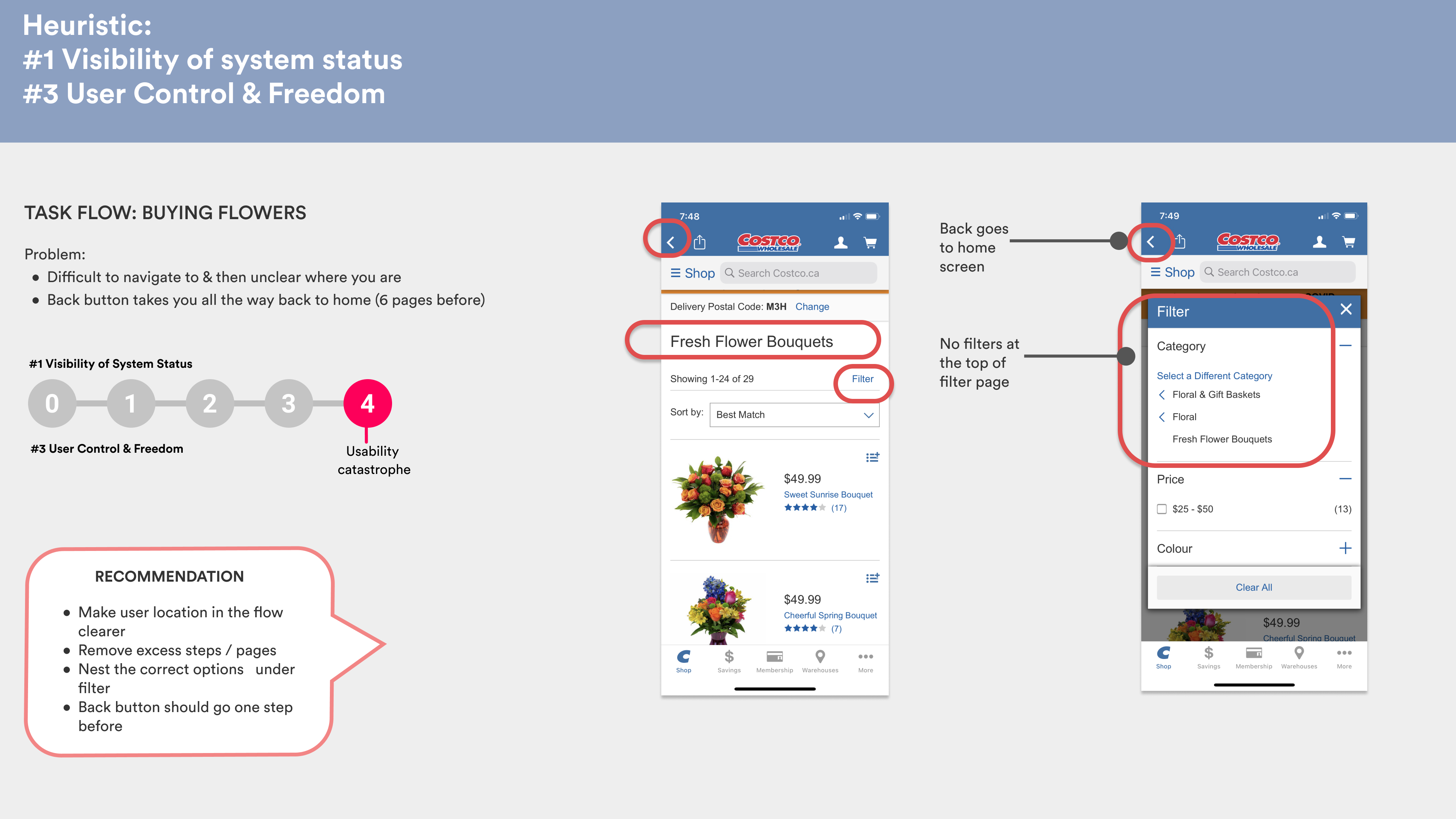
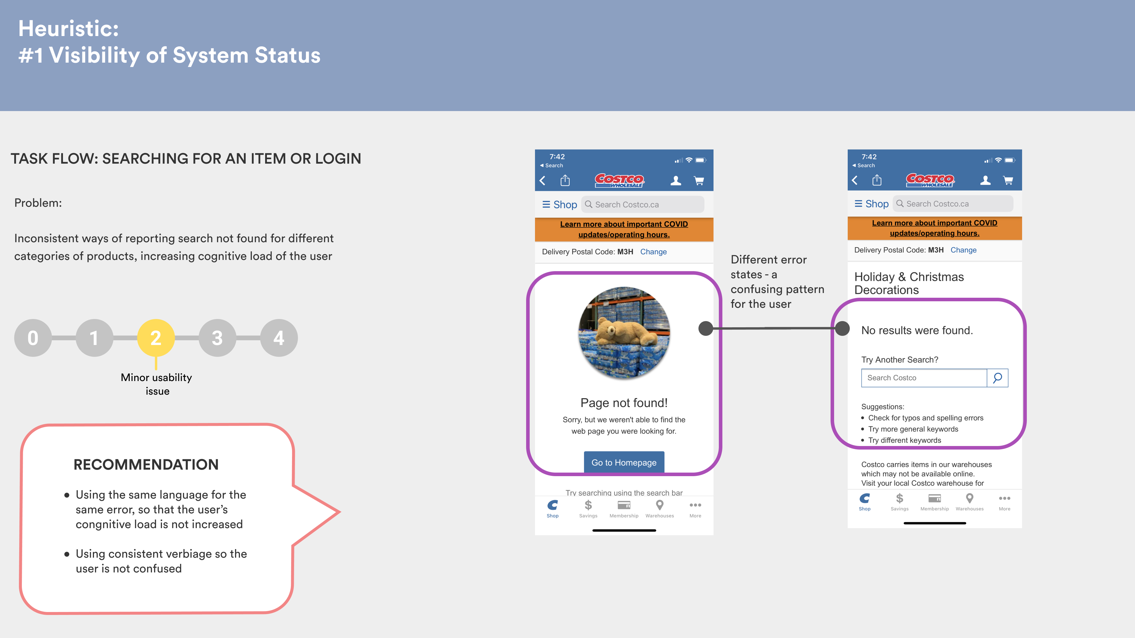
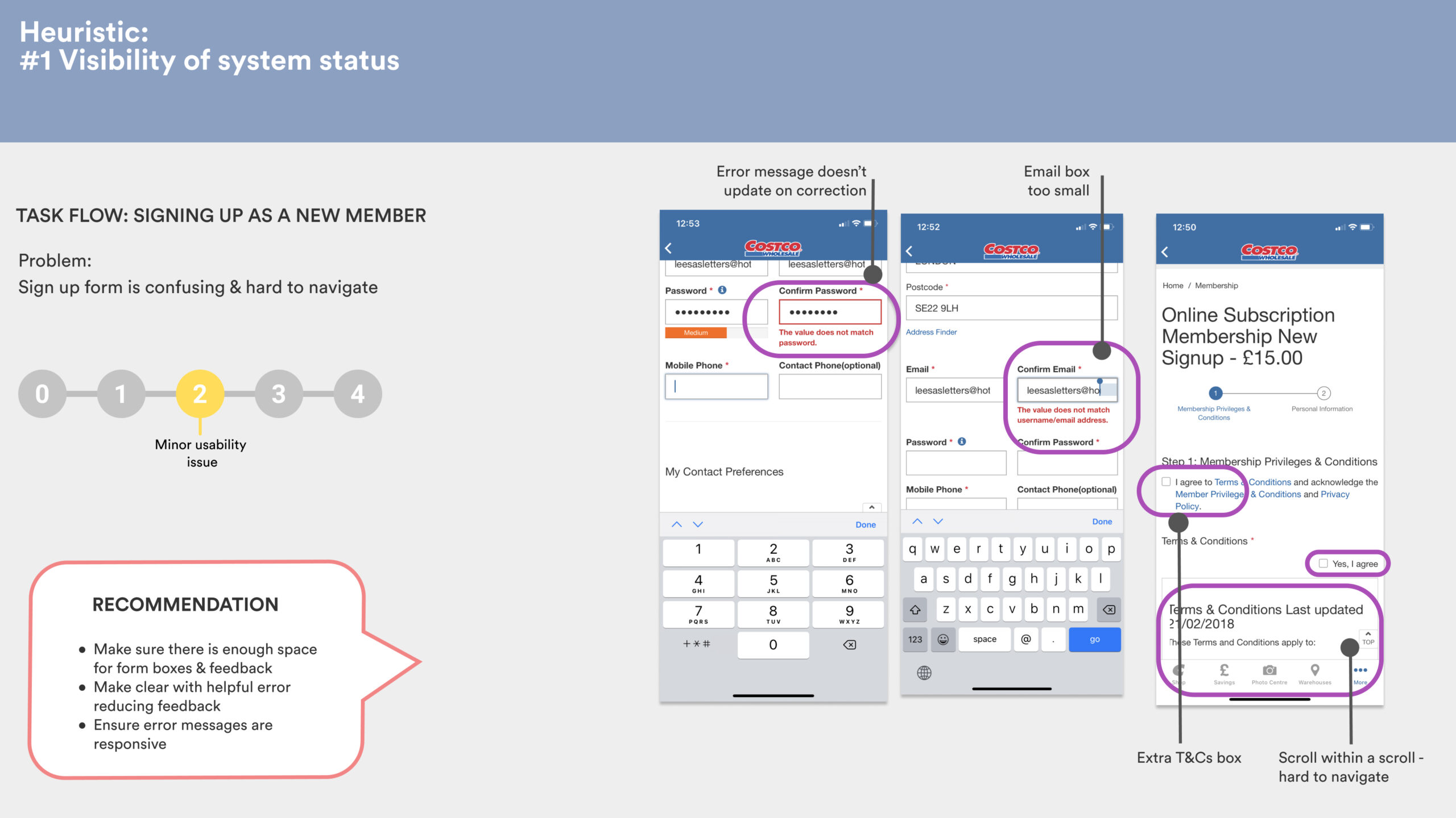
Heuristic Violations on Costco's app in Liza's journey
Overall score
Assigning a severity rating for usability
After applying the heuristics to the Costco digital product, we determined an overall usability score, which was an average of our individual scores.
The overall app is just about functional, but it has major usability issues which lend it a score of 3.
Redesign to improve usability
Mapping customer journey
User flow overview
Having analysed the problems in the user journey, we reiterated the user flow using the flow chart below, and used these for shows the redesign. The journey involves our proto-persona, Alison, discovering items and groceries from the Shop screen, filtering baking items, adding to cart and checking out as a new member.
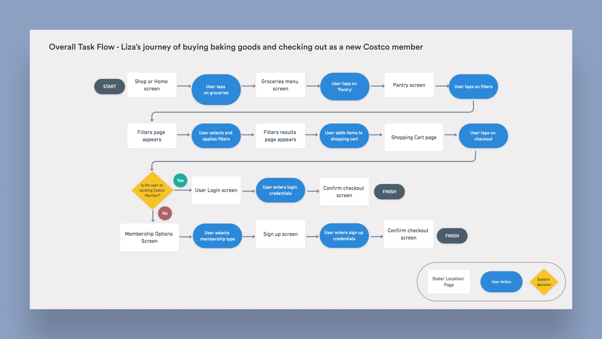
Task flow for redesign to improve Costco's usability
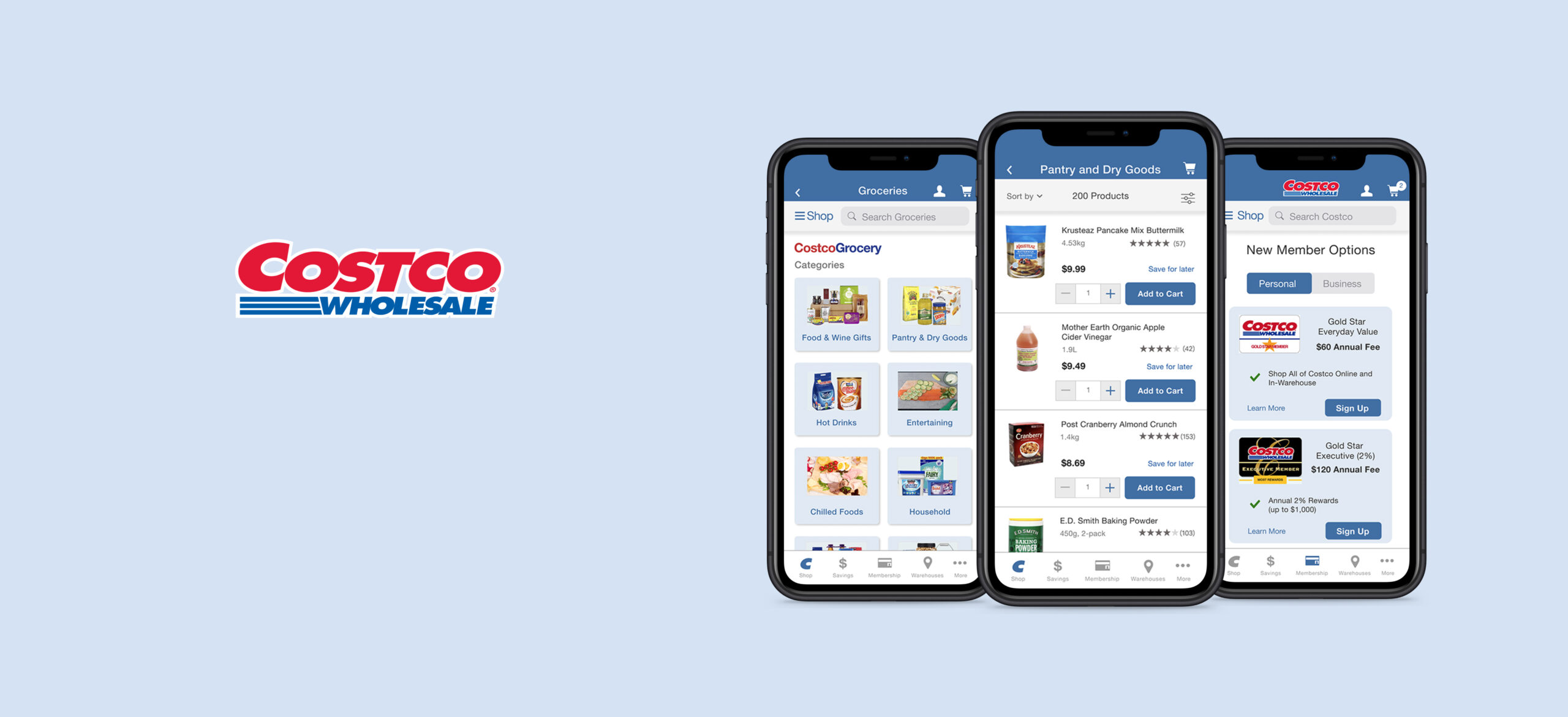
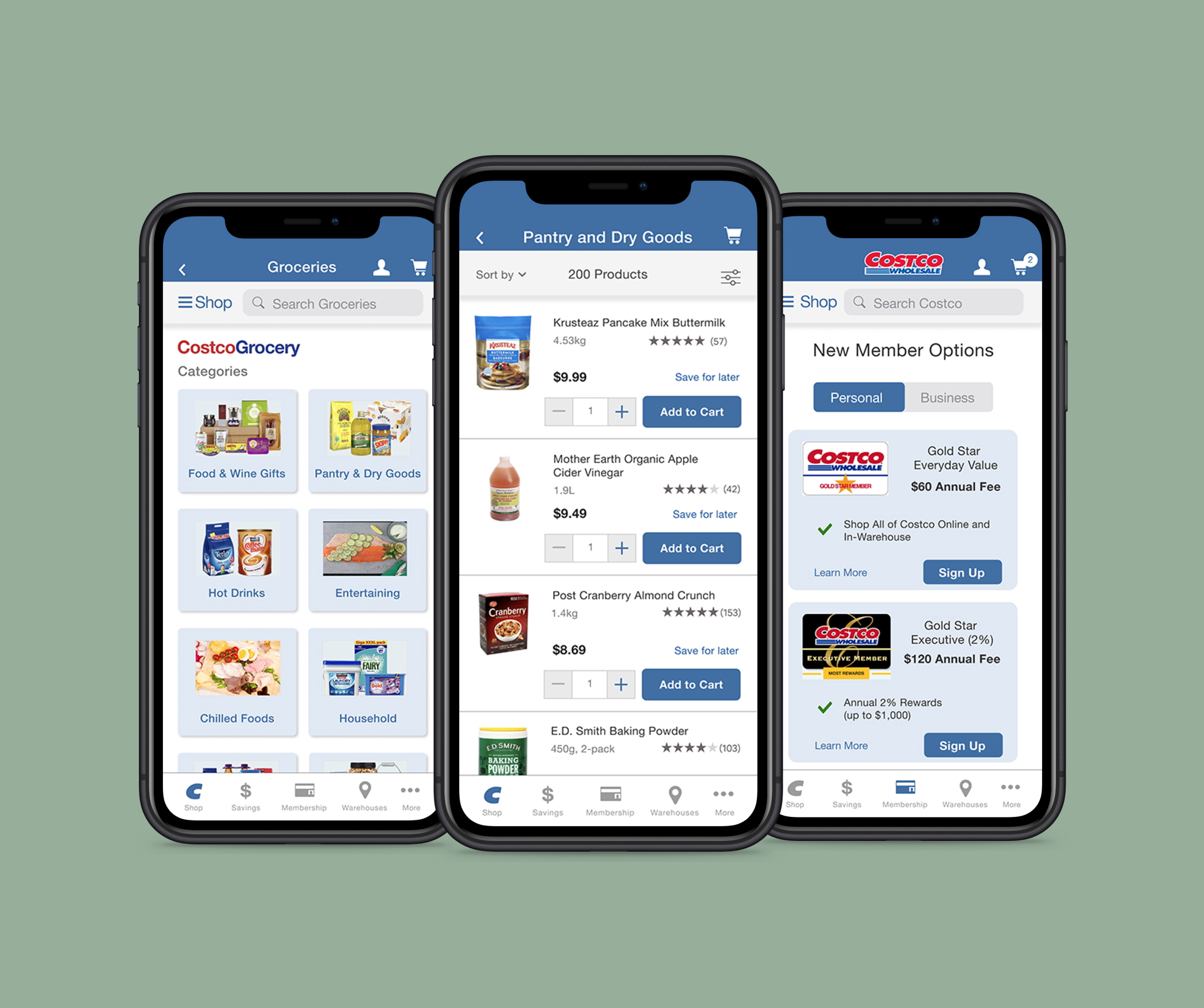
Discovering goods and groceries
Navigating categories on Costco's Shop screen
The landing shop screen and navigating through various categories, focussing on groceries and pantry goods was reinvisioned to include a few improvements discovered through the heuristic evaluation:
• Cleaning banner images, removing a middle navigation which made it confusing for the user
• Organizing information on cards for legibility
• Revisiting information hierarchy and adding card menus for clarity
• Bringing a certain level of consistency to the Shop screen and discovery experience across various countries
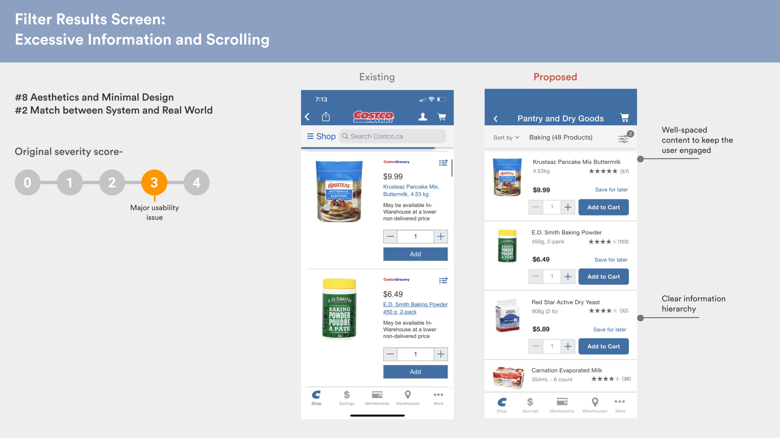
Browsing and filtering
Browsing through Costco groceries, and filtering items
Once the user selects the subcategory of groceries they want to browse, the browsing and filtering was revisited such that heuristic violations can be weeded out. The improvements included:
• Re-organizing content and information for clarity
• Creating a hierarchy within the text information and spacing it out for quick assimilation by the user
• Adding checkboxes for easy and expected filtering method, and providing user control to apply or clear filters
• Providing feedback to the user in case of filter application and showing the relevant filtered inventory listing
Checking out items
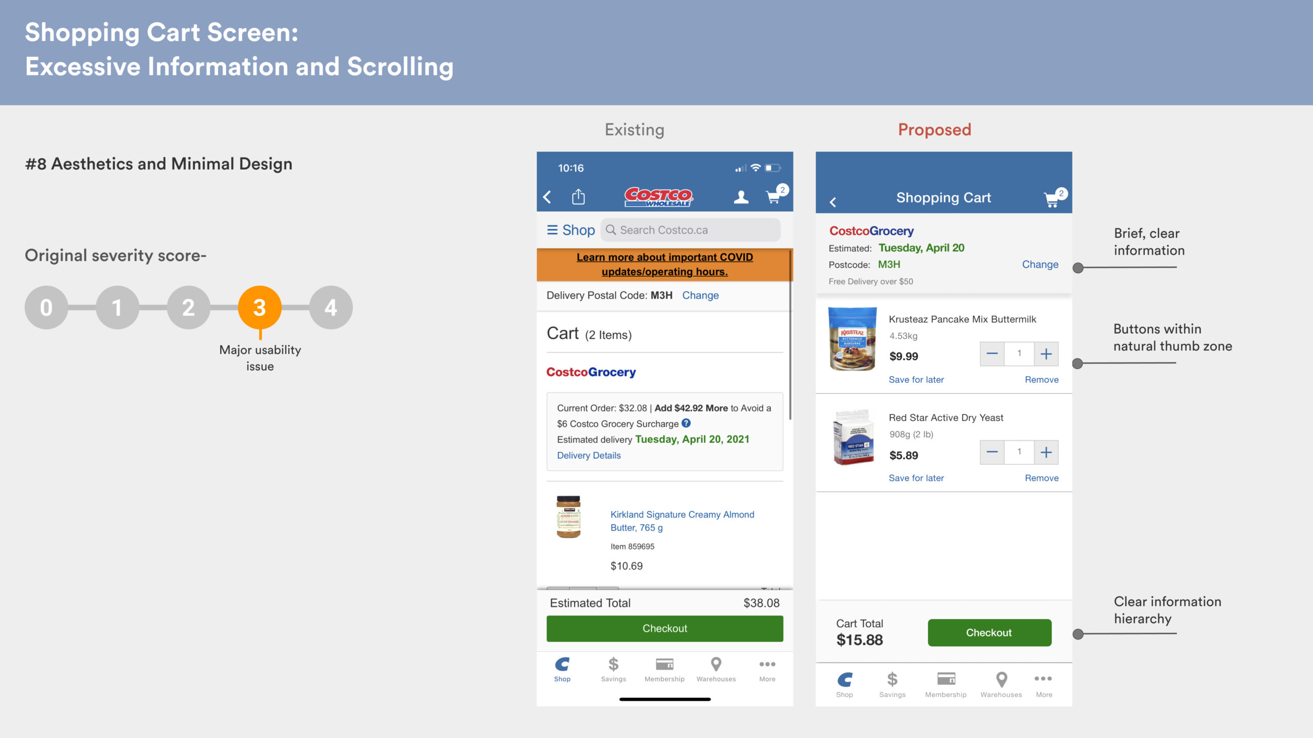
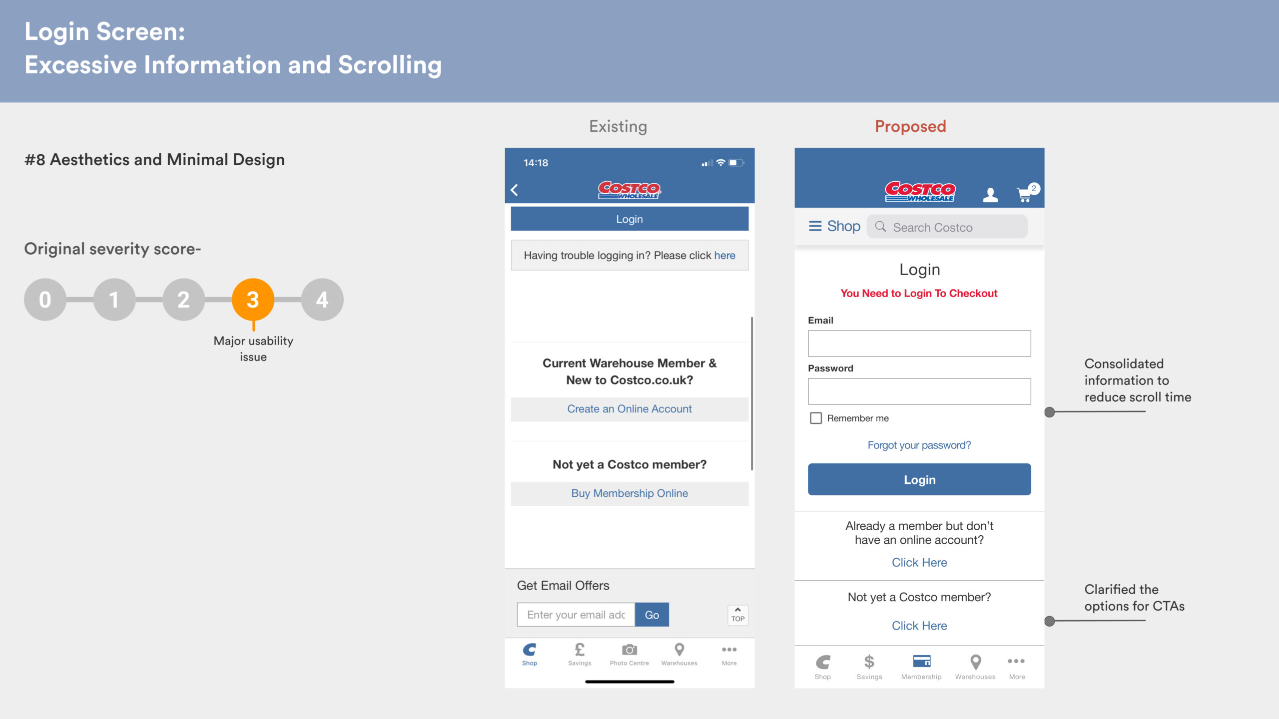
Shopping cart and member login
The cart screen and the login screens were reinvisioned to include a few improvements discovered through the heuristic evaluation:
• Consolidating information for easy assimilation by the user
• Moving buttons within the natural thumb zone for easy access
• Reorganizing information to create a clear hierarchy
• Clear CTAs and nesting additional information within sections
Membership Sign up
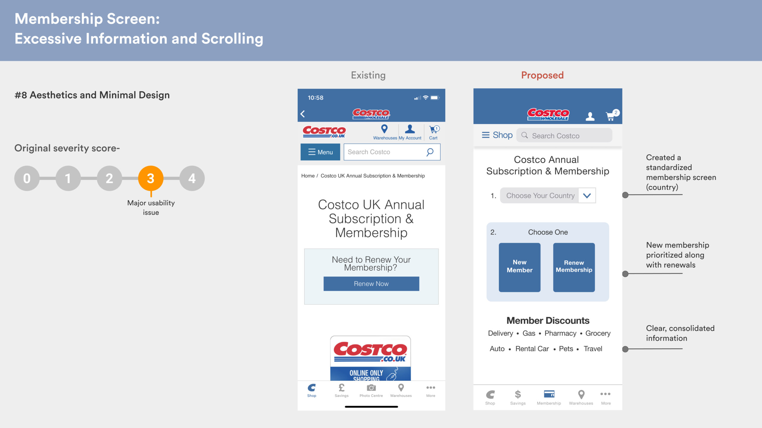
Membership options and new member sign up
There was a lot of scope to improve and prioritise new member joining and easy choice of plans. At the moment, the Costco app feels a lot like a website and requires excessive scrolling to absorb information. The following improvements were made to these screens:
• Adding 'new membership' clearly to prioritize memberships
• Adding the option of choosing one's country, since member perks could differ countrywise
• Allowing clear CTAs and nesting additional information under 'Learn more'
• Allowing easy comparison of membership plans
• Redesigning the sign up form for quick filling allowing more character count and clear error feedback
Test, Test, Test
Usability testing
We used our redesigns to conduct 3 usability tests. With all our recommendations applied to the task flow, our redesign has zero usability issues from the users perspective.
This ensures that the redesign will reduce bounce rates and create a huge impact on the business, and Costco users will love the app as much as they love the in-store Costco experience.

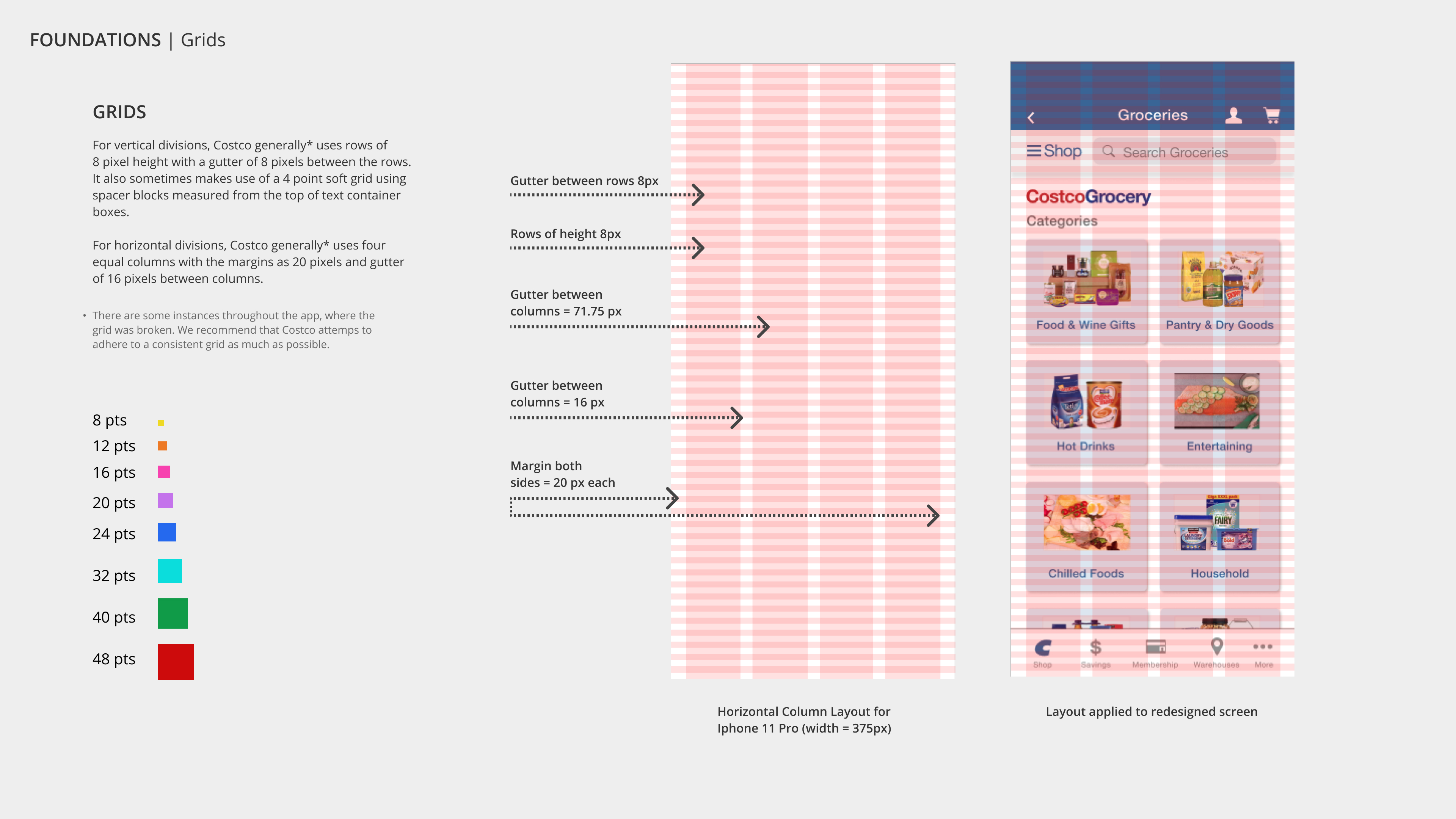
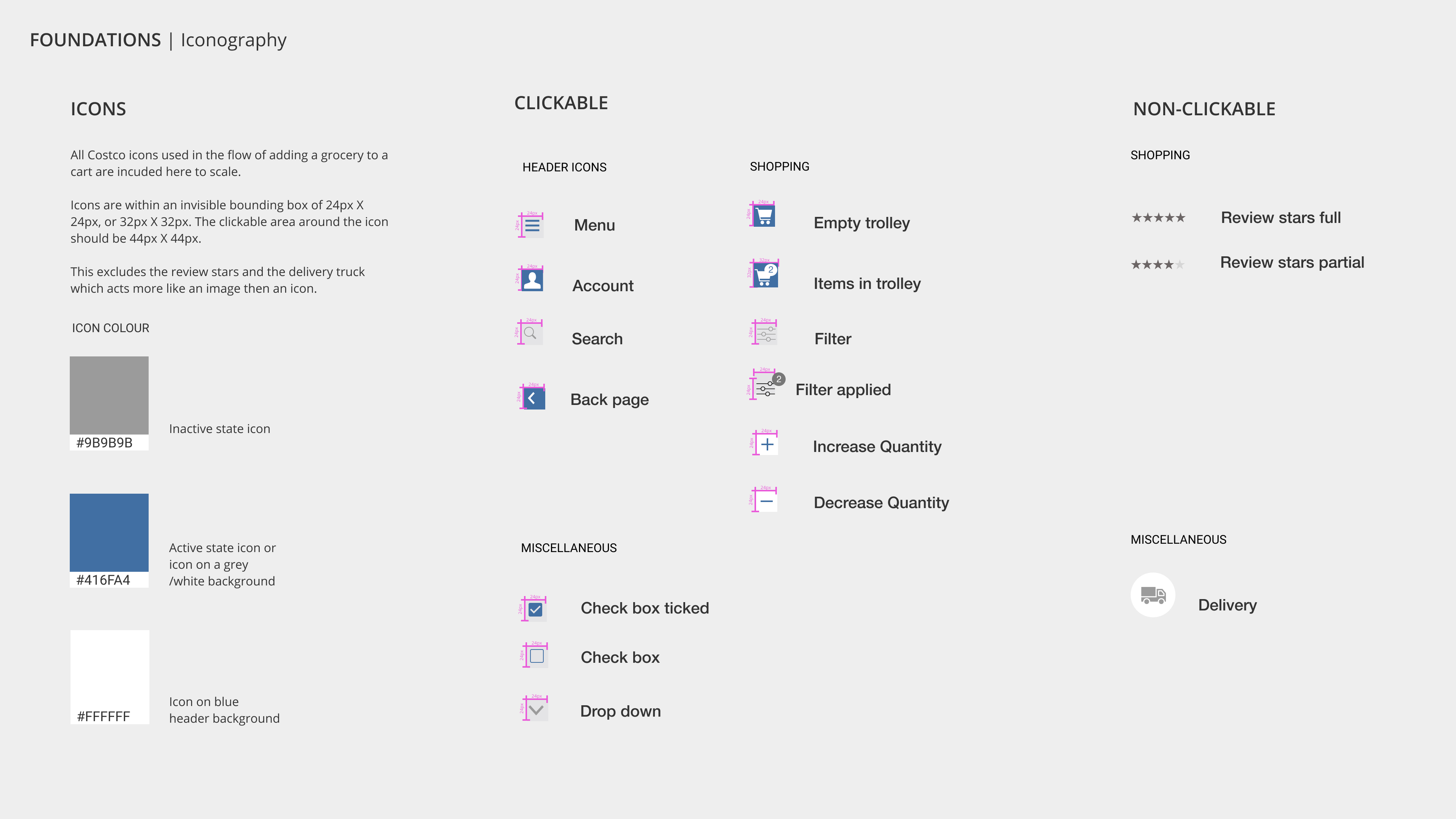
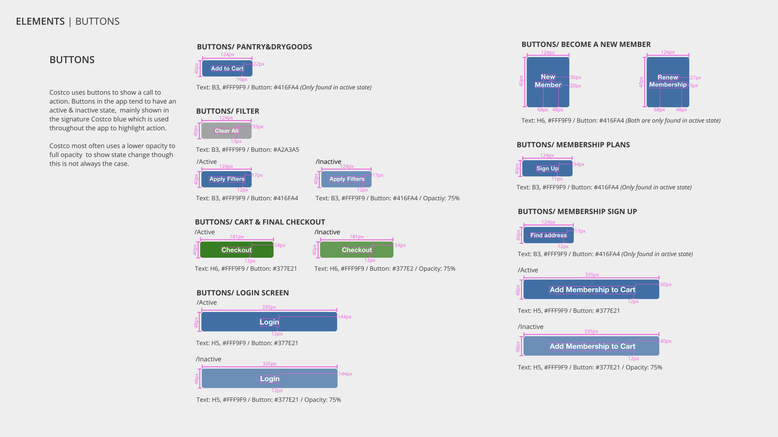
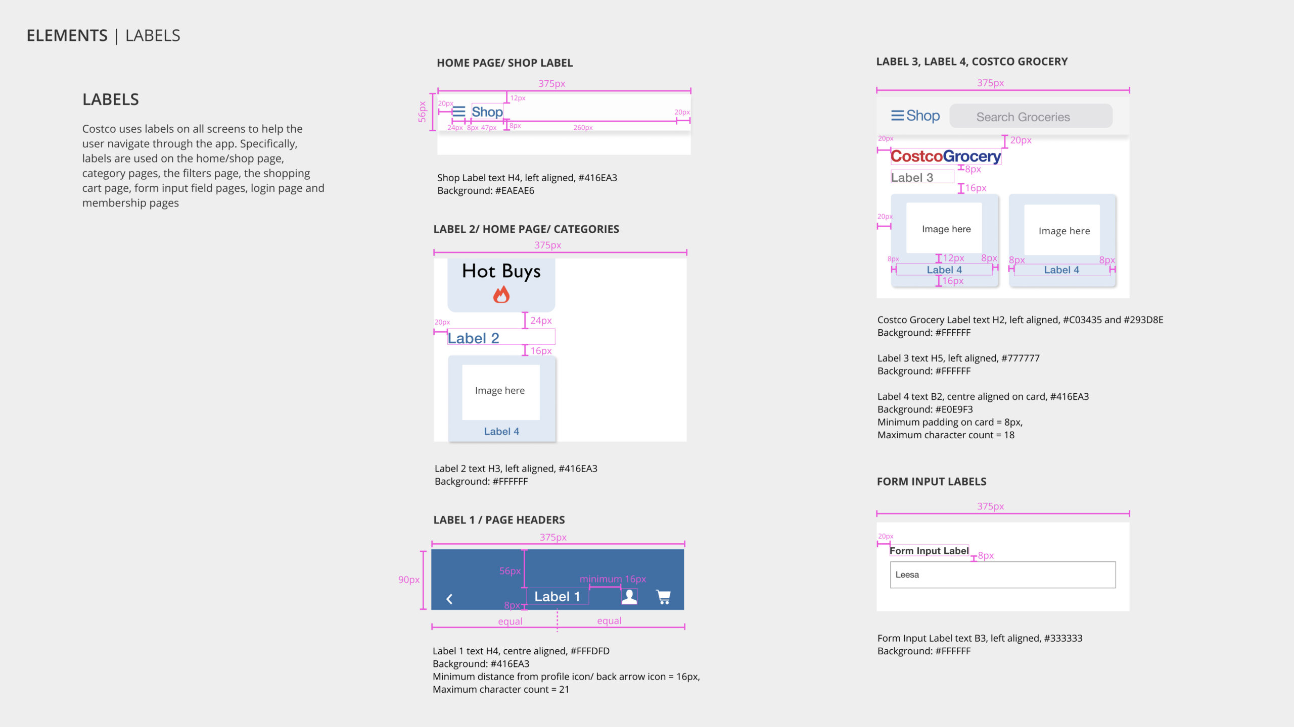
UI Library for Costco
UI Library and Design Systems
Documenting UI elements to create build-ready assets
The Atomic Design Methodology by Brad Frost was used as the general classification guideline to document the design system used for the task flow screens redesign.
Click on the button below to view the entire UI library & design system documentation as a PDF file.
Next steps and Key learnings
Reflecting on the project
Next steps and key learnings
The experience of the heuristic analysis and redesign process has come with learnings at each stage. Foremost, the value of teamwork - we were 3 women working across continents and time zones and analysing a product from a unique point of view since certain screens, including the Shop screen, appeared slightly different across the three countries.
Another learning was deep-diving into the user's experience using heuristic principles, and when redesigning, applying UX laws such as Fitt's law, Hick's Law, Jakob's Law etc, to lend the subtle nuance to the product, which exponentially increases user engagement and reduces bounce rates.
The next steps would possibly include a complete information architecture audit and refining the categorization, as well as updating some of the assets for the product.
Selected Works
We Score Design SprintProject type
Pocket ParksProject type
Costco UI RedesignProject type
Cloak by MastercardProject type