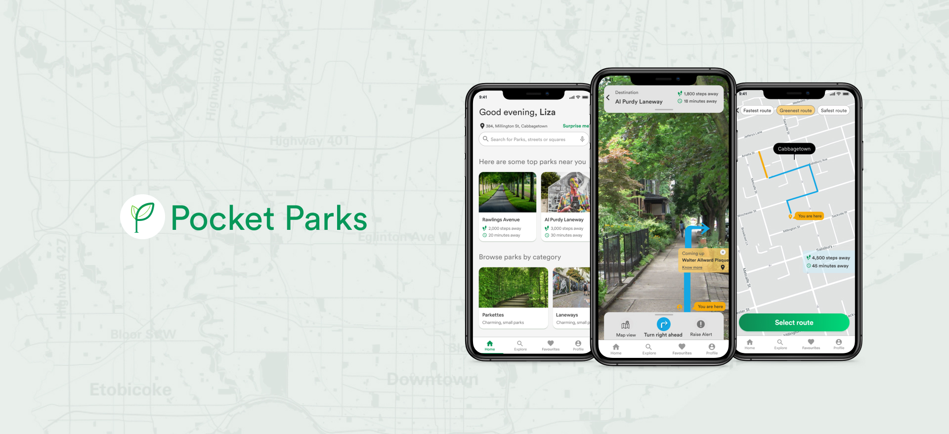
Pocket Parks
Pocket Parks is an app designed to help people living in urban areas discover outdoor spaces in their neighbourhoods, an experience essential to their overall well-being. It also allows the users to select the best routes to walk to these parks, with an option to learn about neighbourhood trivia along the way. Pocket Parks helps people find their happy places :)
Project Highlights
Role UX Researcher, Design Strategist, UX Designer, UI Designer
Project length 10 weeks
Tools Figma, Sketch, Invision, Principle, Photoshop
Discovery of problem space
A casual conversation with a friend
Recently, a friend had mentioned that neighbourhood parks in the city of Toronto got extremely busy. This seemed to cause stress, since being outdoors was a real stress-buster for them. Since the pandemic, it was also the only way they met other people or interacted with community. That got me digging deeper around this problem space.
The city of Toronto is a burgeoning metropolis where the density in certain areas is fast compounding. As a result, neighbourhood parks and outdoor public spaces tend to get extremely crowded, and are inadequate for the increasing population in this area. This encouraged me to find out more about the problem space through secondary and primary research.
Design process
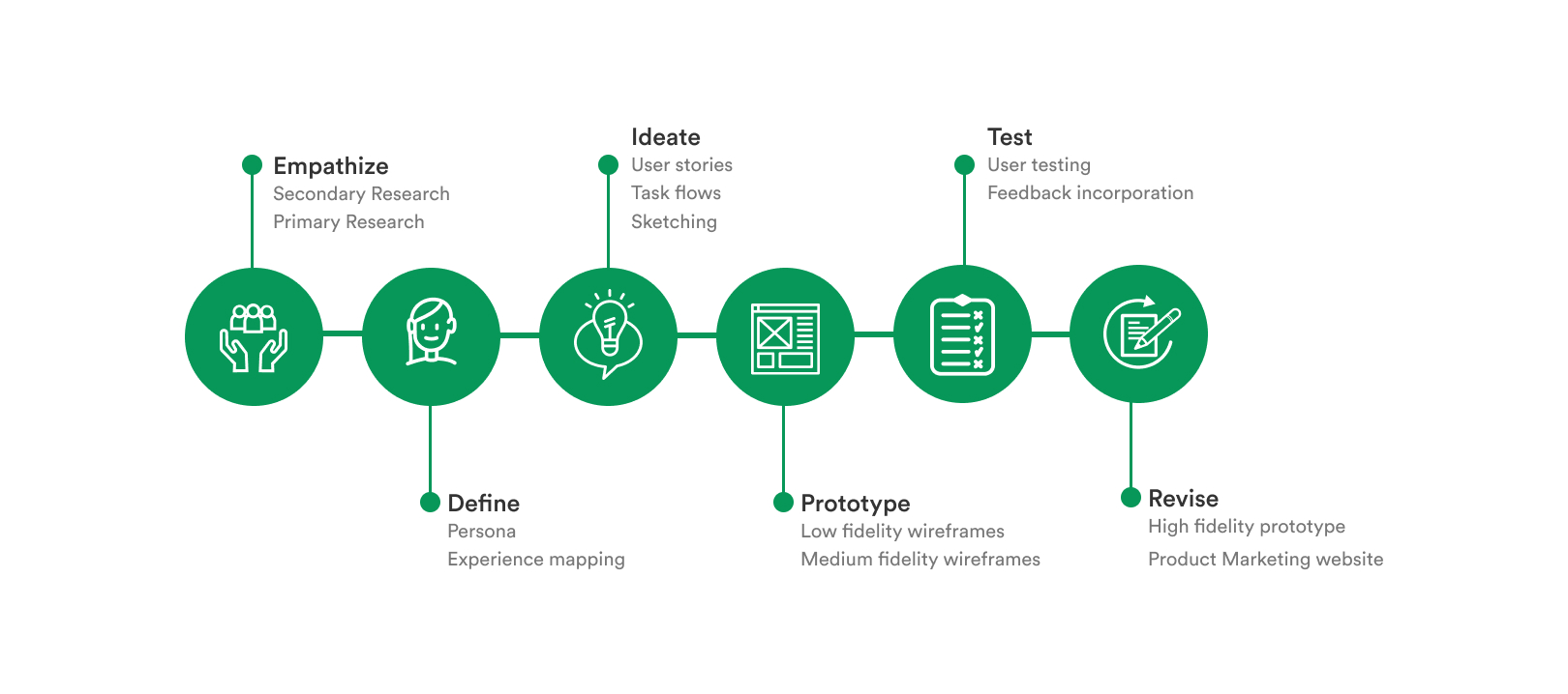
End-to-end design thinking
I followed the design thinking process to ensure that my design decisions for my final product was rooted in research. I wanted all aspects of my design to trace back to the pain points, motivations and behaviour of my user that was identified in my research.
Empathize
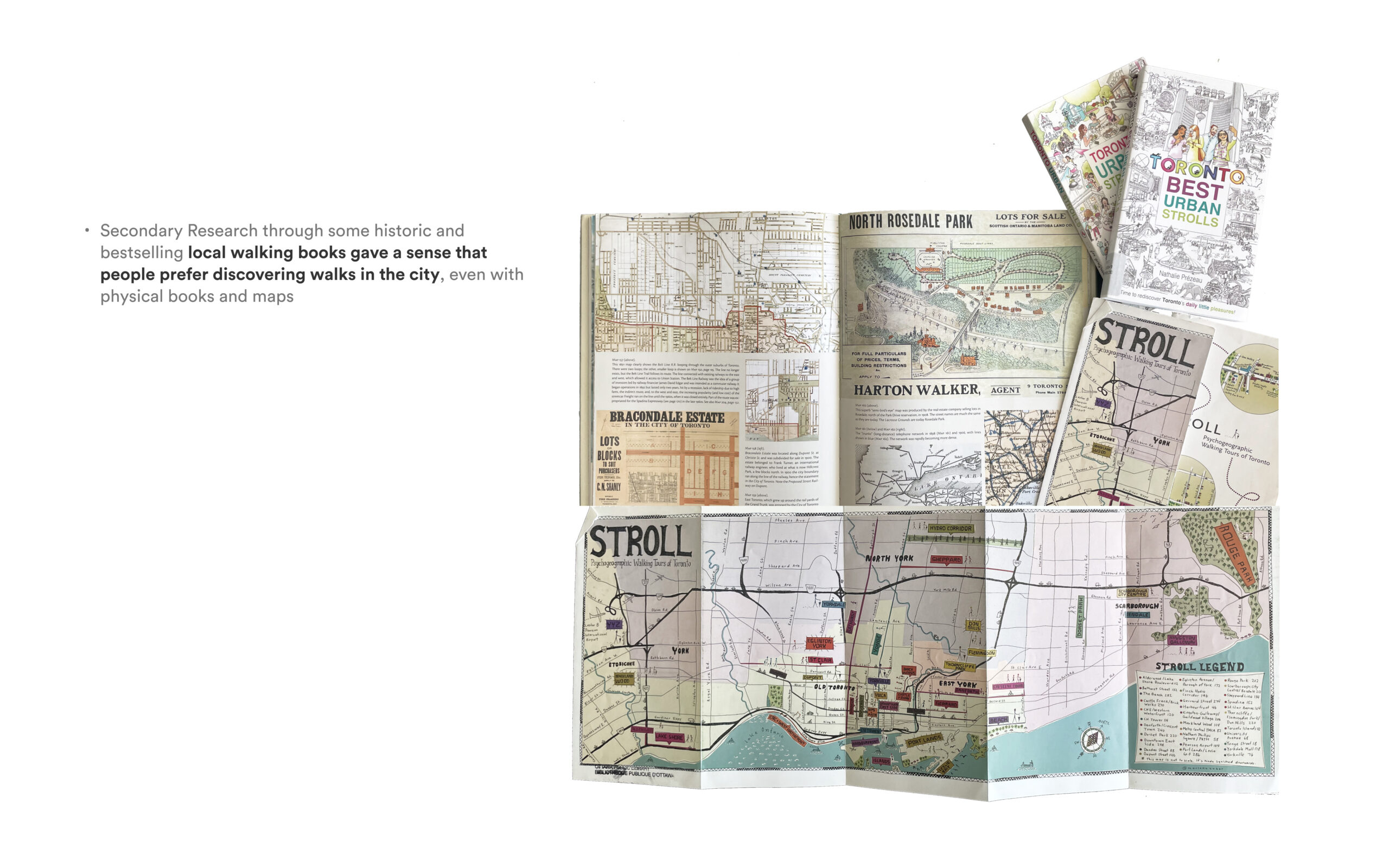
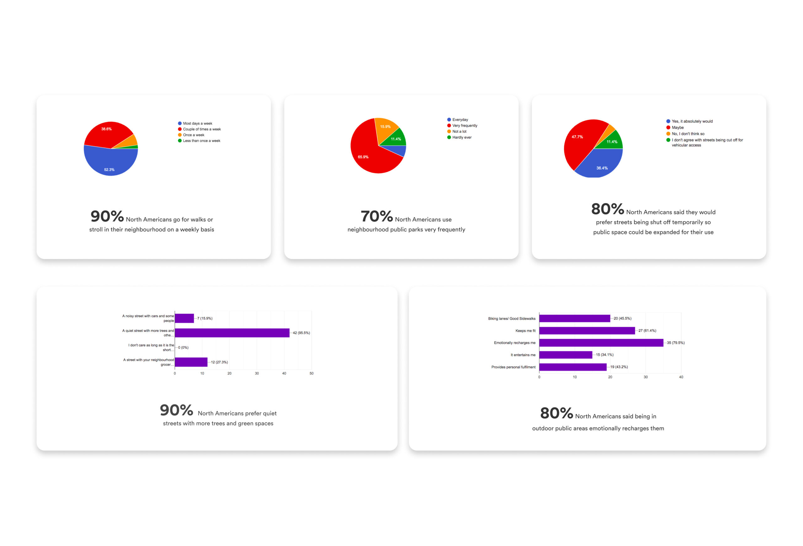
Secondary Research
What are the challenges people face?
The following outcomes were a result of the secondary research I conducted:
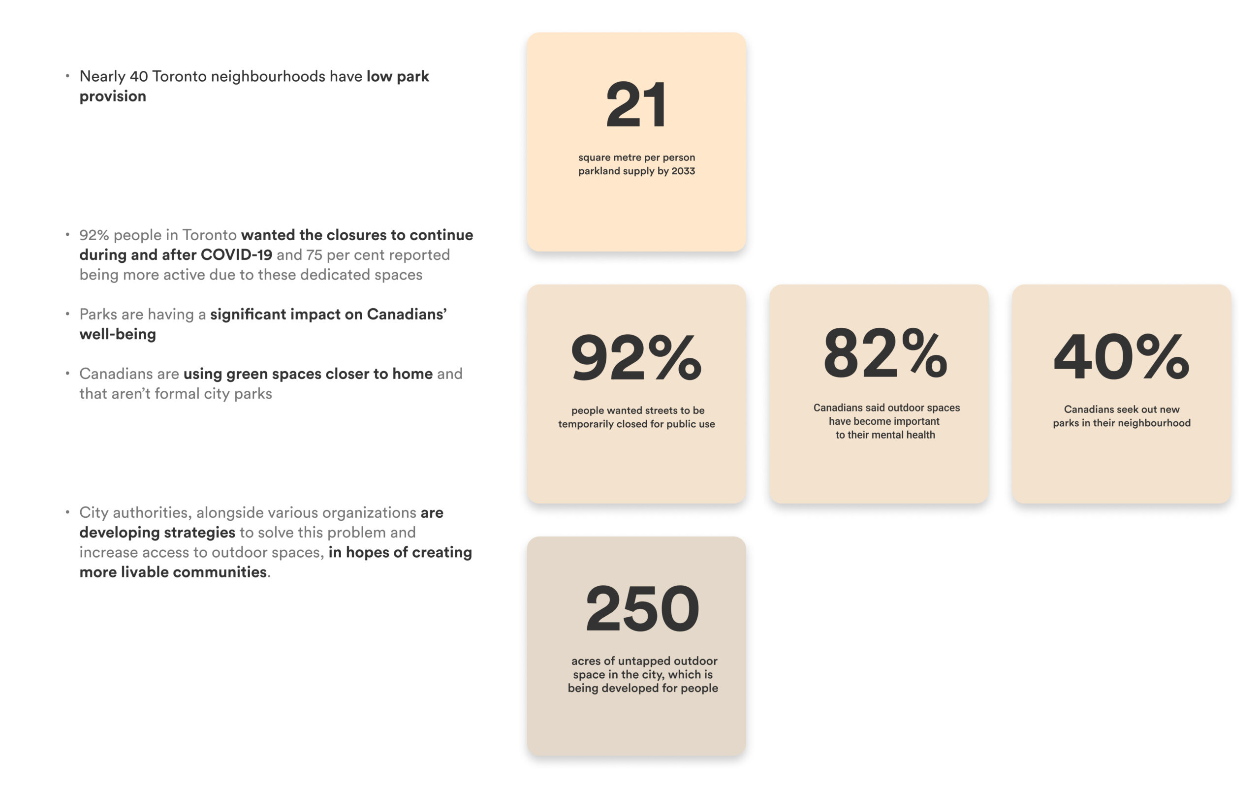
Secondary Research findings
Primary Research
Quantitative and Qualitative Research based on conversations with users
In order to validate my assumptions and hypothesis, I conducted primary research around the problem space with the target demographic of millennials based in Toronto. Using both qualitative 1 on 1 interviews and quantitative interviews in the form of email surveys, I gathered the pain points, motivations and behaviours of these potential users.
Based on the interview summary, the major emerging themes were Discovery, Well-being, and Outdoor Space Attributes.
Gathering insights from user interviews
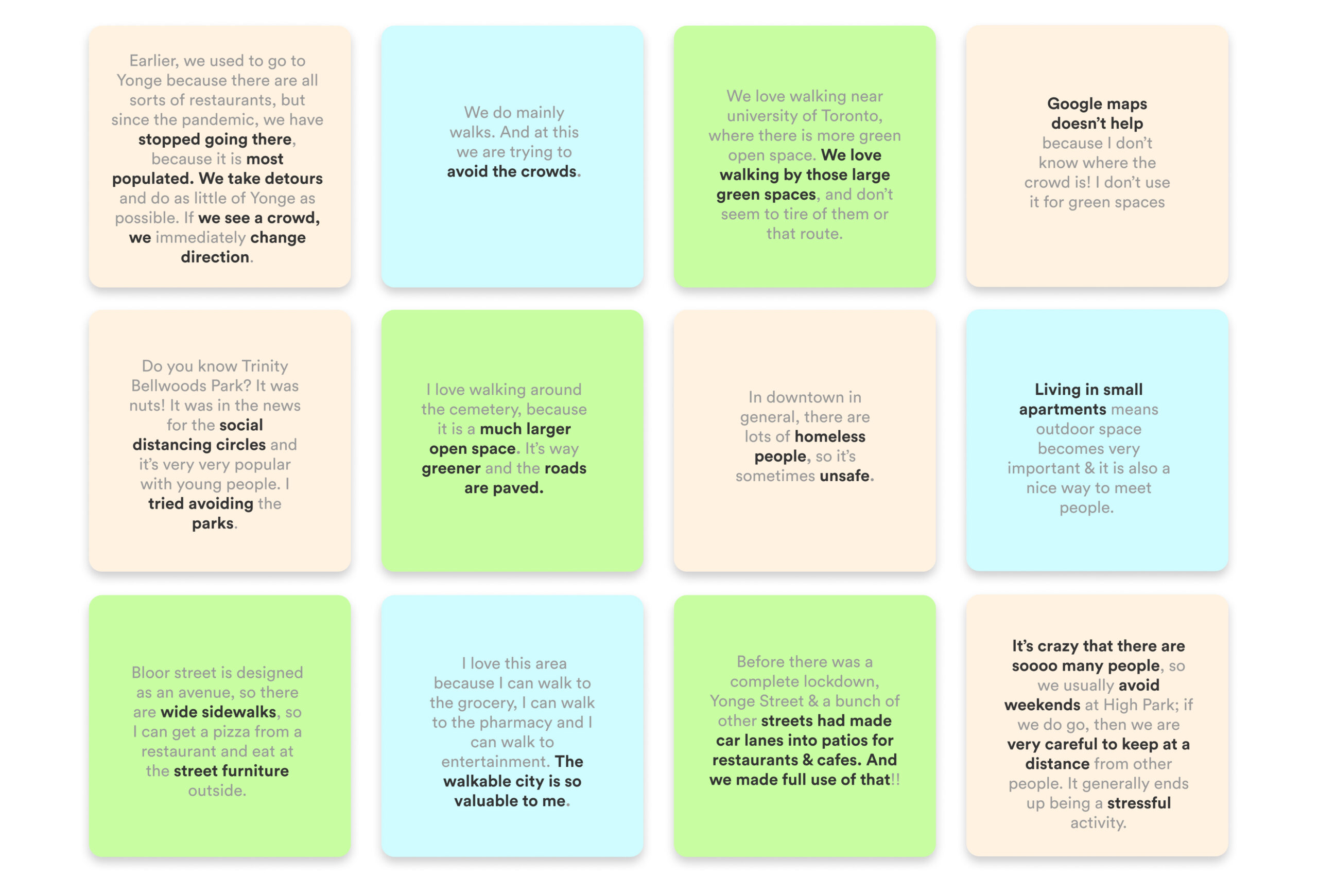
Primary Research - Qualitative and Quantitative
Define
Persona
An archetype to represent my users
From the interview insights, I was able to get a better sense of the millennial experience. With this research, I articulated a persona, which is an archetype built to identify our real users’ profile, needs, wants and expectations, so that we may design the best possible experience for them.
The gender of the persona is a woman to better empathize with our user, as safety is a major concern for all women. Thus, I chose a woman to represent the complete data.
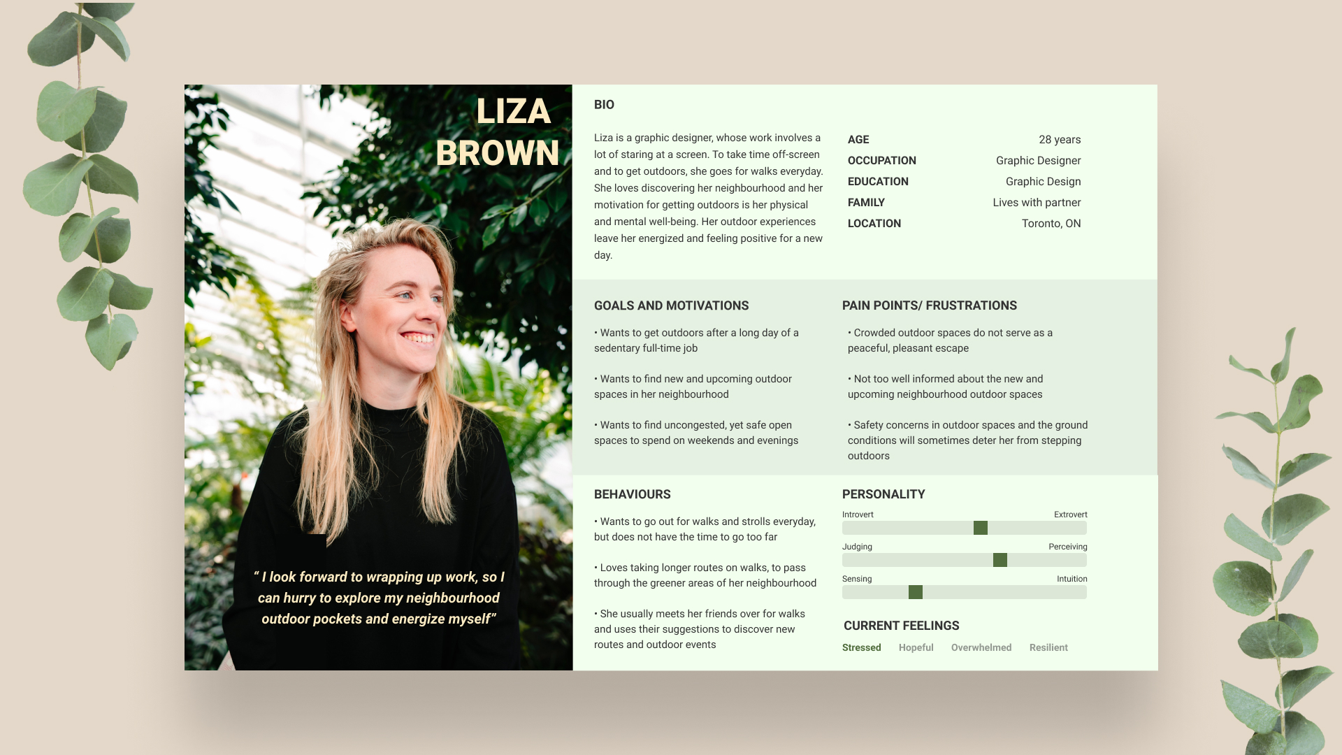
Primary Persona
Experience mapping
Mapping a probable progression of Liza's journey
Based off of the persona, I crafted an experience map or journey map to visualize the progression of a probable experience Liza might have. The map helped to clearly identify pain points throughout the persona’s journey, as well as to reveal potential areas of opportunities to intervene to alleviate these pain-points.
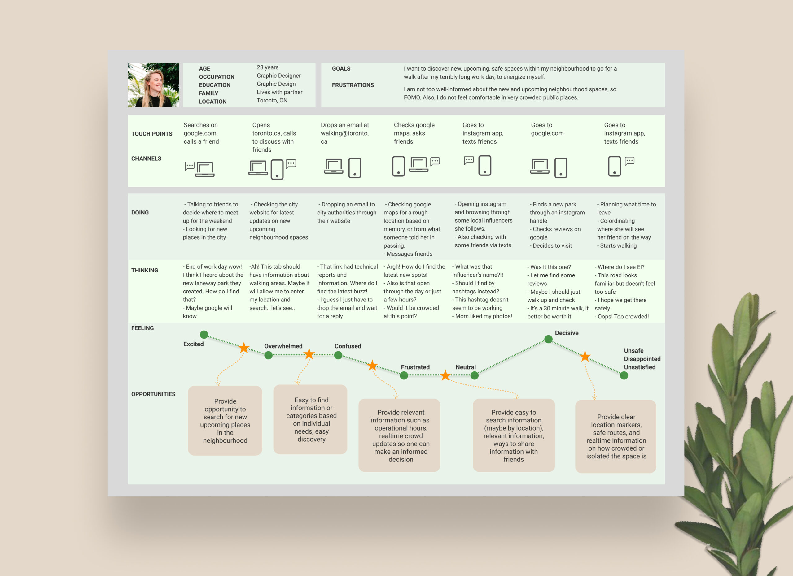
Liza's experience map of finding a new park in her neighbourhood, and walking to it
Product Stategy Guide
Understanding how to provide the best value to our target group
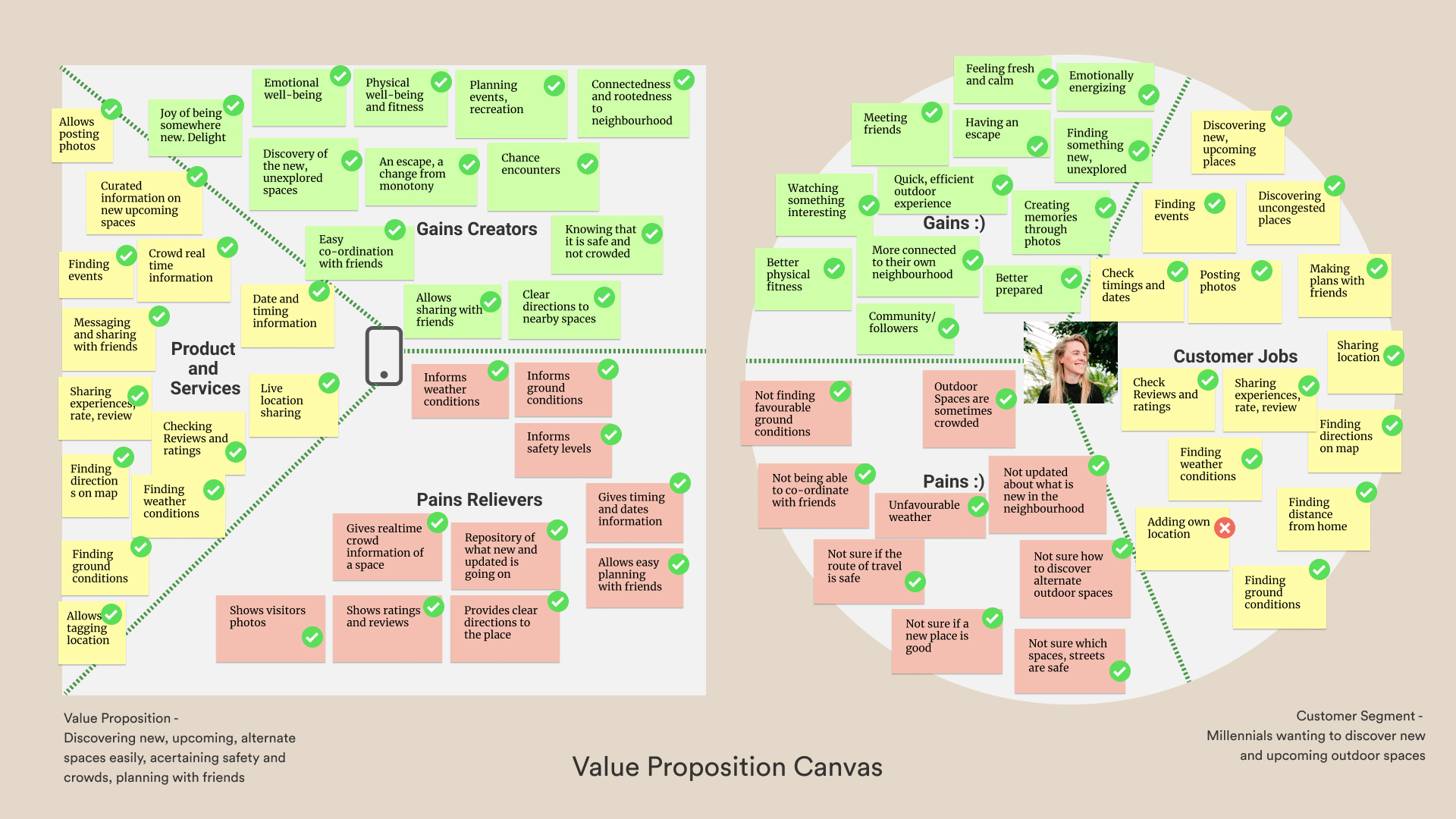
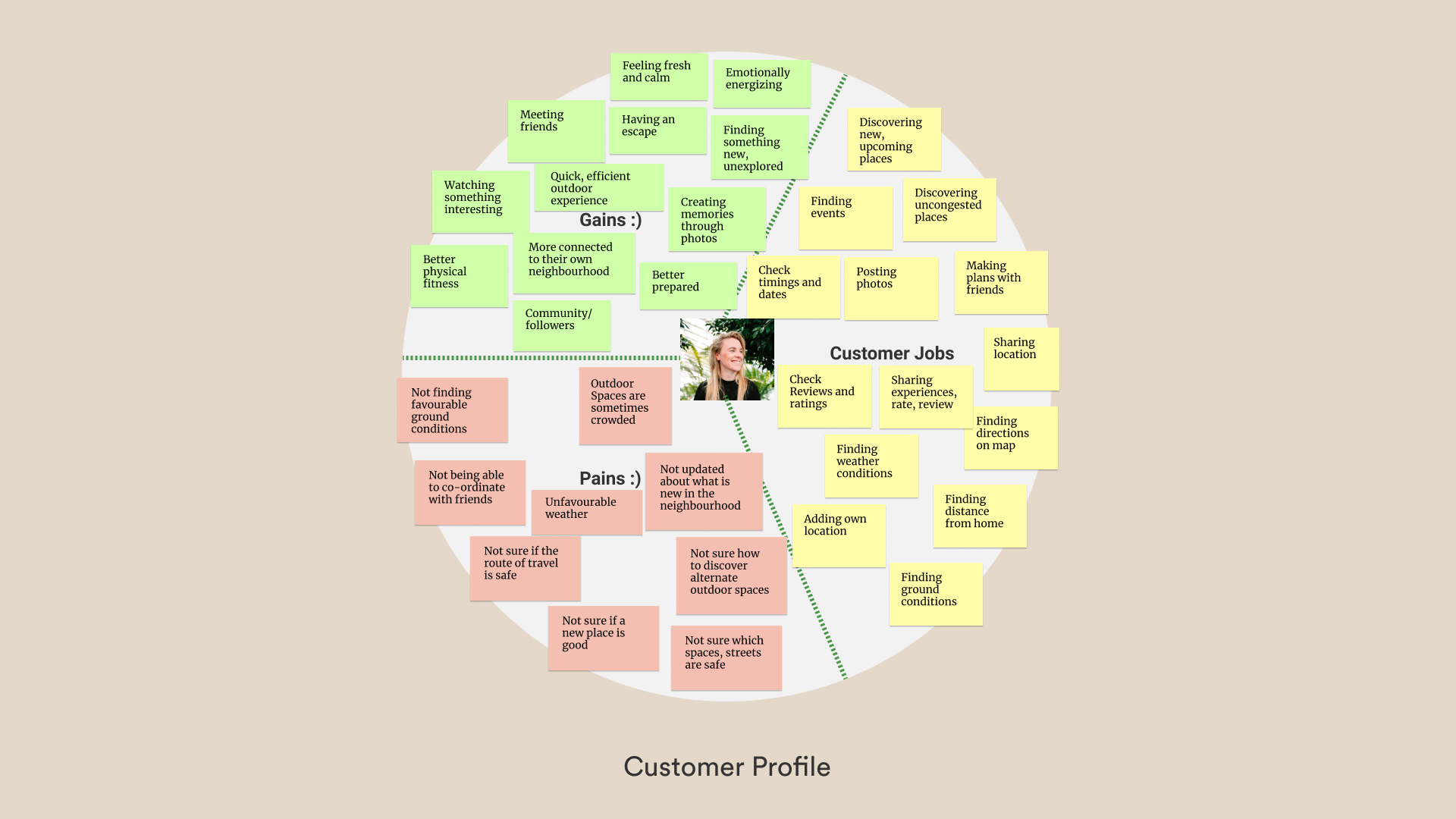
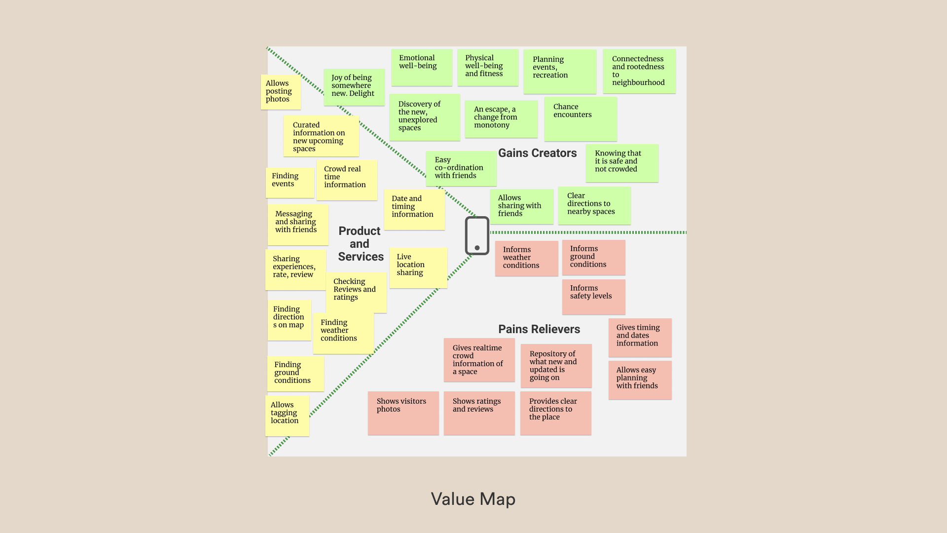
As part of the larger Business Model Canvas and Product Vision,
and to understand my customers more deeply, I articulated a Value Proposition Canvas to see what products and services will be of value to my target group.
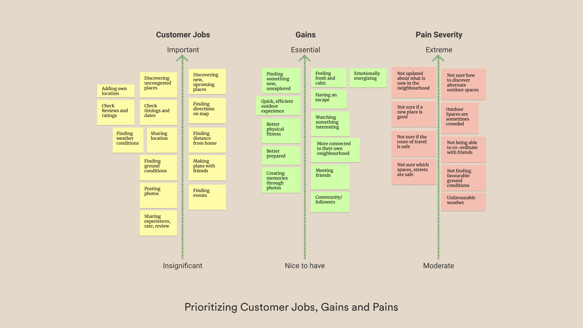
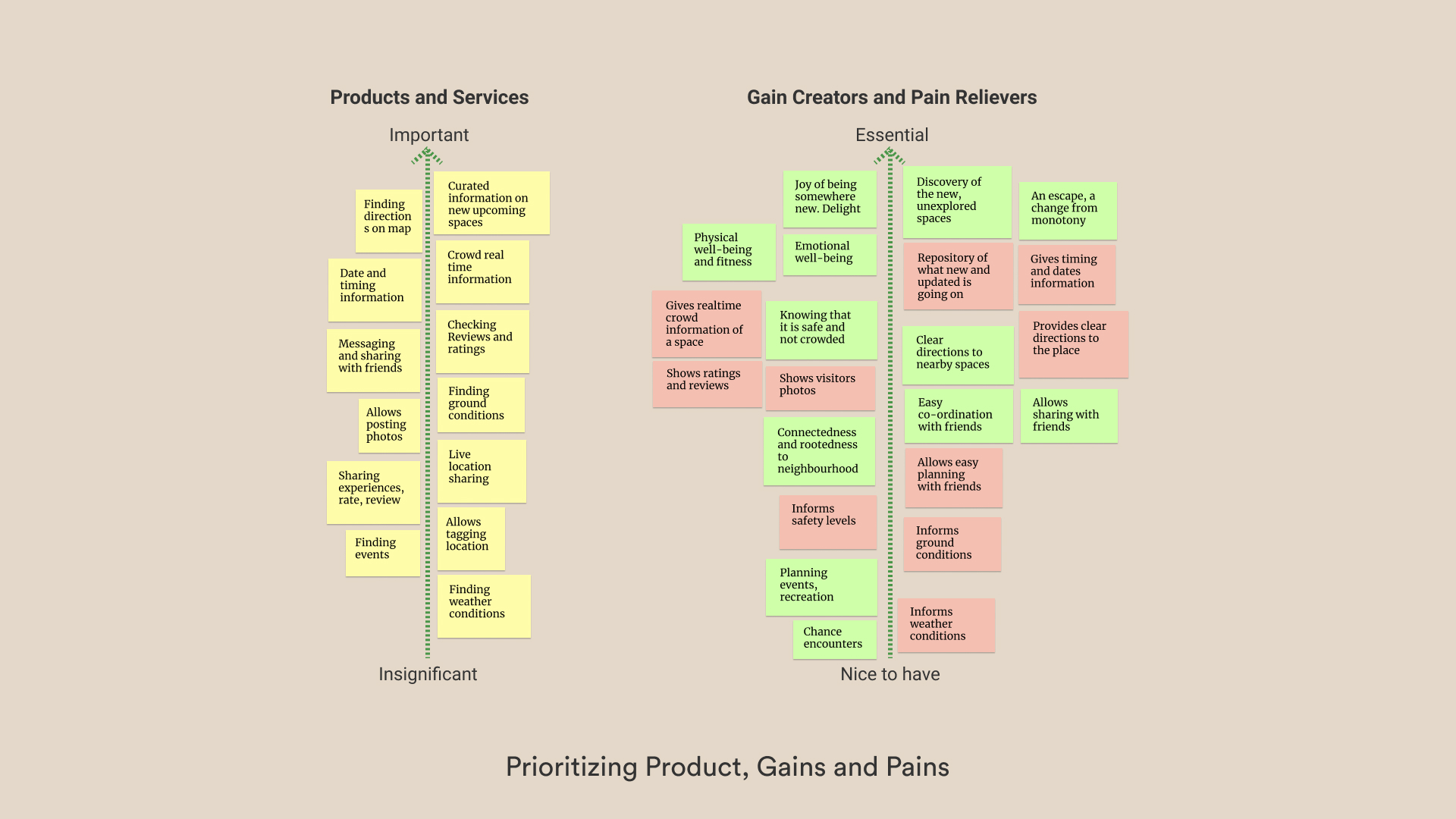
Making an exhaustive list of customer/ user jobs, their pains and gains allowed me to empathize with the user completely. Laying out the product and services, pain relievers and gain creators on a priority axis, helped me understand the core functionality my product needs to have.
The prioritizing of the jobs, pain relievers and gain creators helped me identify the ‘fits’. The solution got further reinforced because the jobs started co-inciding with the dips in the user's experience mapping.
How might we
help millennials in the city of Toronto discover new, upcoming and uncongested outdoor public spaces and parks, in order to improve their physical and emotional well-being?
Ideate
Epics and User Stories
Focussing on the MVP
Once I had a focussed HMW question, I started further defining user roles from the persona, and articulating user stories, for detailing out all of the possible functions that might be included in my solution. Each user stories addressed an action that is motivated by the user's goals and detailed one benefit achieved by taking said action.
Simultaneously, I thought through the main epics based off of my hypothesis. The major epics were -
1. Searching for a park/outdoor place
2.Finding directions to the park
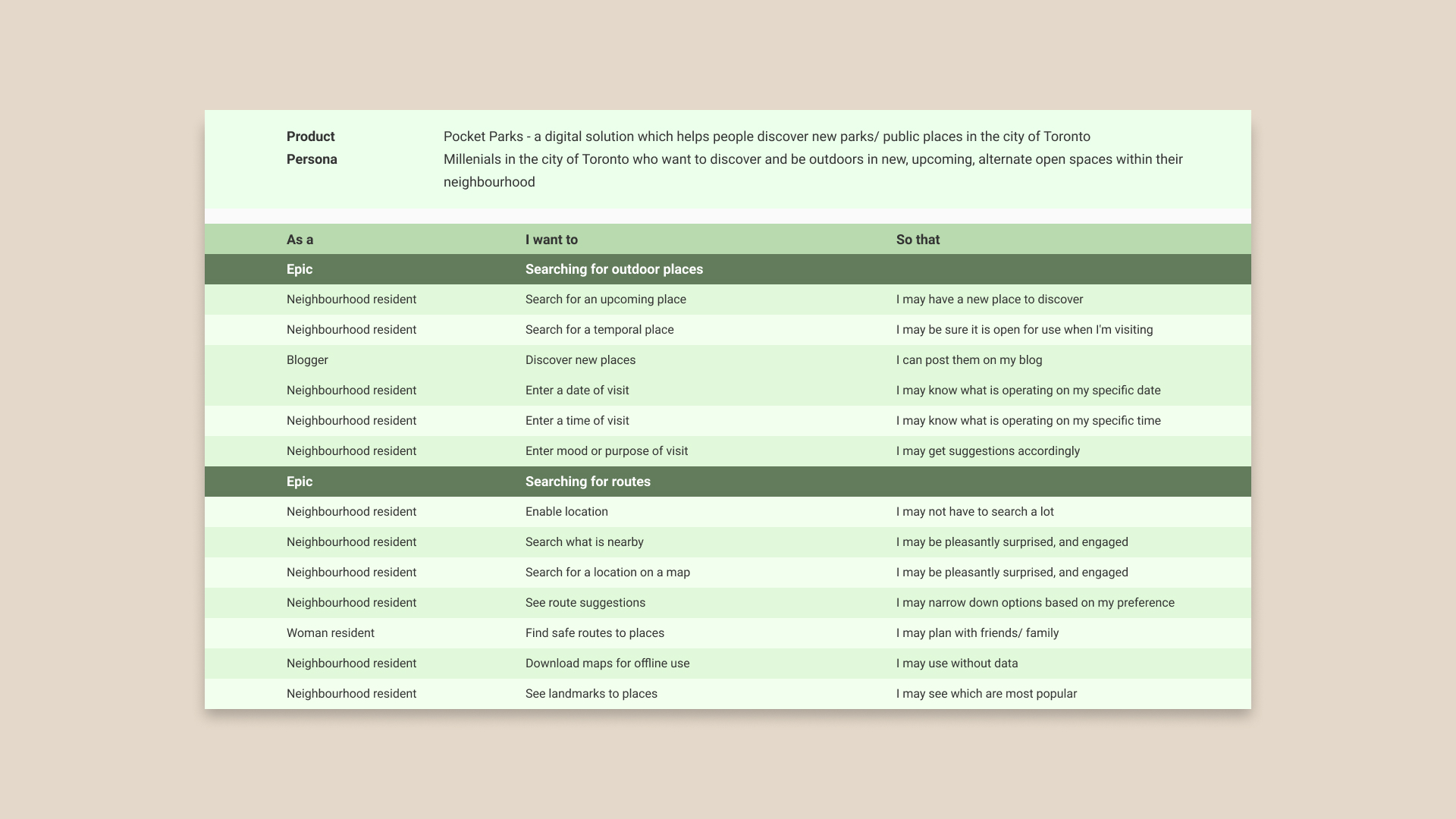
Some key user stories
Card Sorting
Getting a sense of the overall app architecture
After writing out the user stories, I struggled to proceed with finalizing my primary and secondary task flows. To make progress, I revisited the Value Proposition Canvas to review the main values my app creates for the users. I also revisited primary interview insights to remind myself of the users’ pain points, and constantly checked if the solution would actually address their pain points.
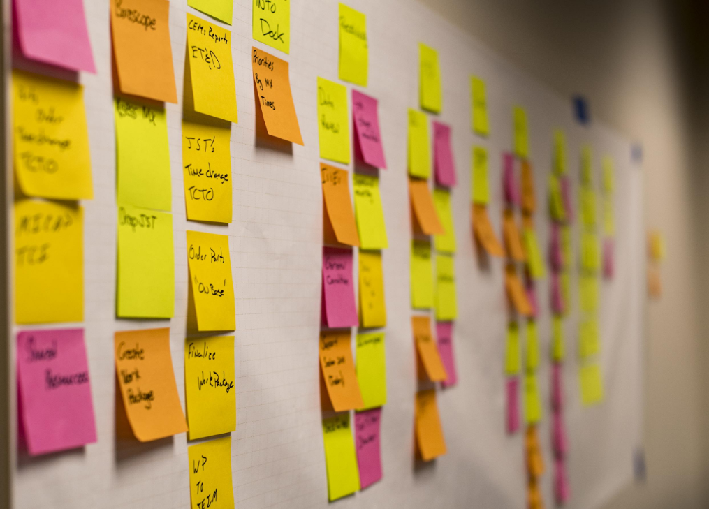
To build conviction in my process, I chose to do a card sorting exercise to begin putting things into categories and simultaneously visualizing the app architecture. This exercise helped me recalibrate, refocus, recall my priorities and also helped me identify a level of information which was missing.
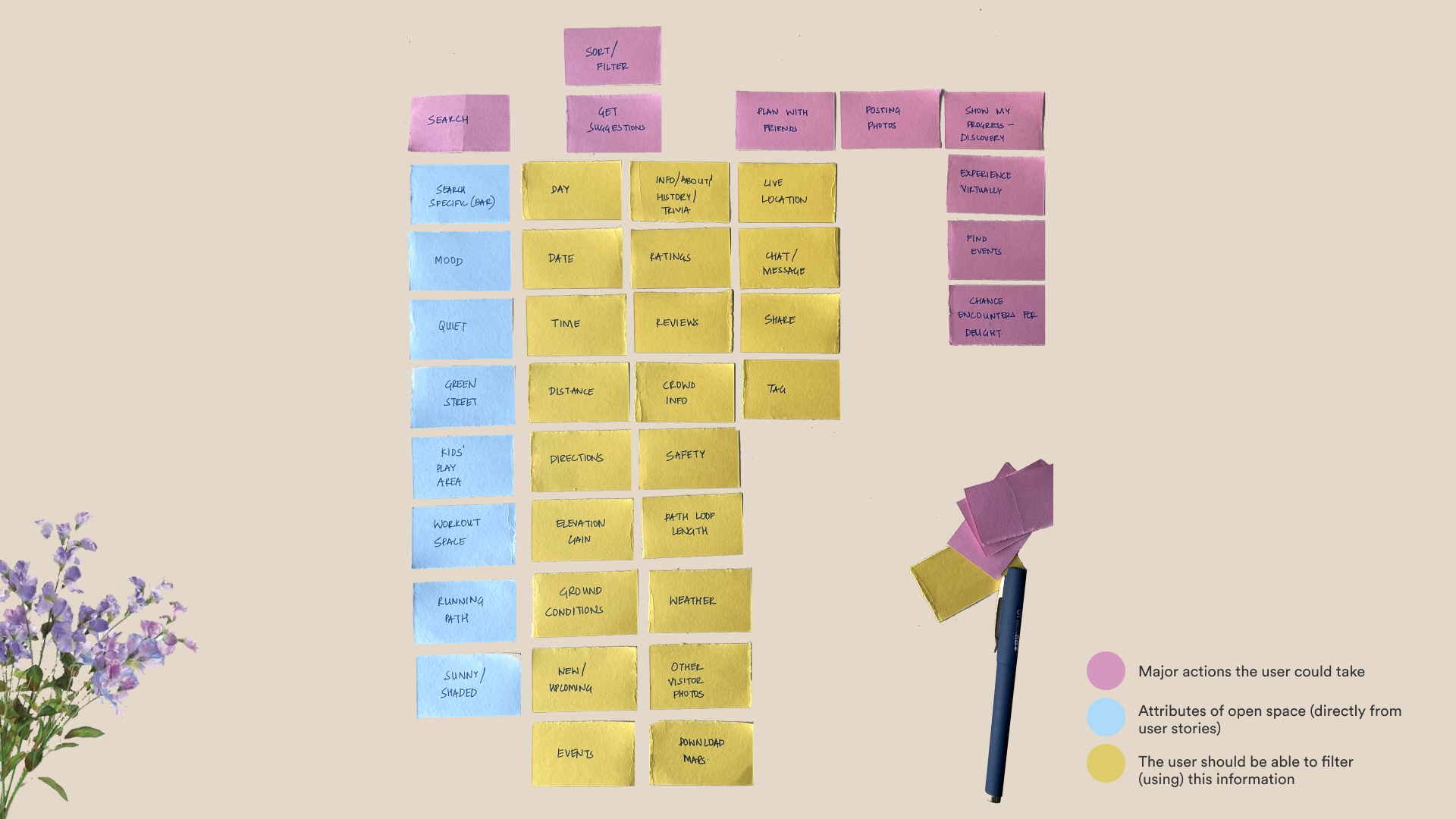
Card sorting exercise to inform the task flows
Information Architecture
Creating a blueprint
The card sorting exercise revealed a level of information which needed to be incorporated; these were the park categories that the user could browse through. Thus I built out the rough blueprint or a visual representation of the product's infrastructure and hierarchy to then inform my primary and secondary task flow diagram.
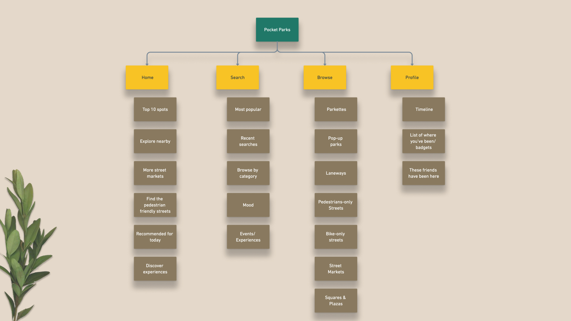
Building the Information Architecture for Pocket Parks
Task flows
Mapping the user's journey to achieve a goal
Based on the various epics and user stories, and with additional exploration using the card sorting exercise, as well as a sense of information architecture of the app, the primary and the secondary task flows were finalized.
Primary Task flow
Epic Searching for an outdoor park
Task Searching for an outdoor park near her house based on her preference
Persona Liza has just finished her work for the day, and wants to step out for a walk in her neighbourhood
User Stories As a neighbourhood resident, I want to find upcoming parks around my neighbourhood based on my preferences
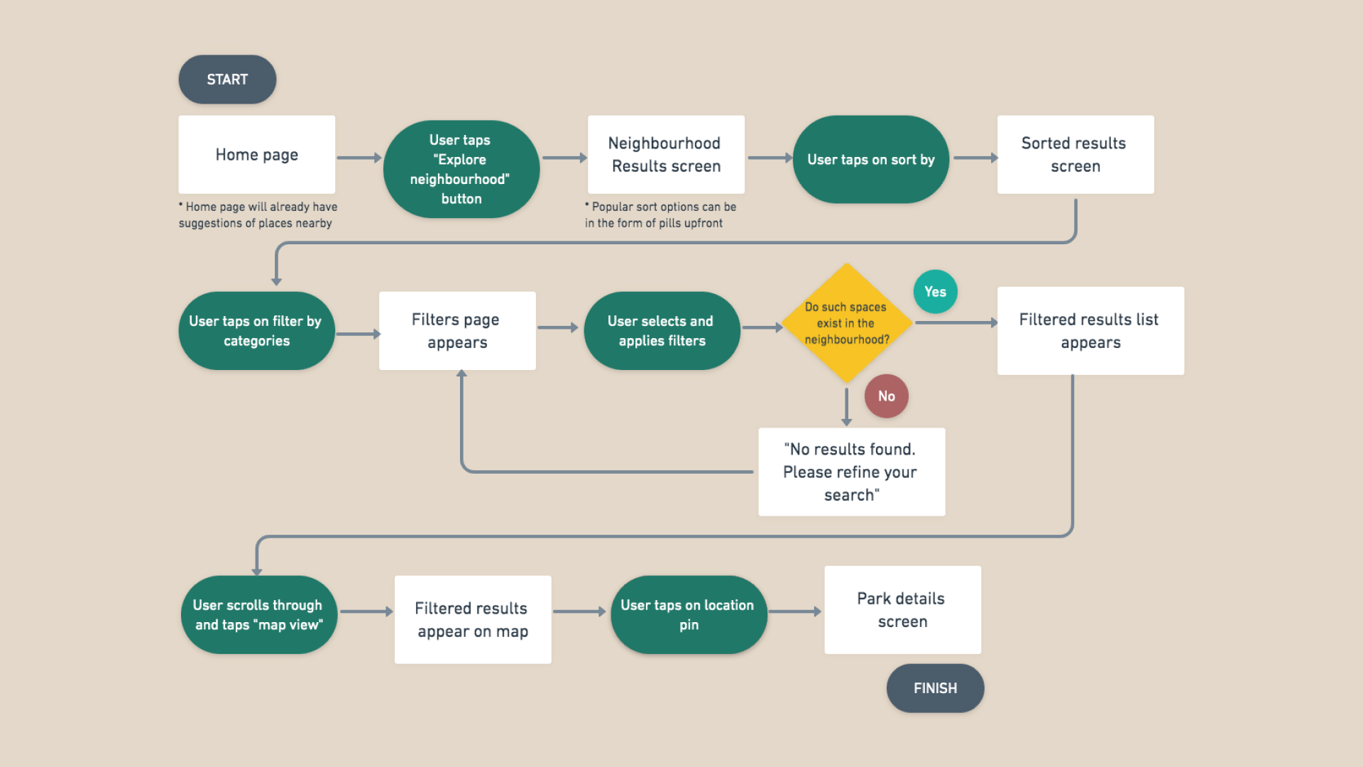
Primary Task Flow diagram of discovering a park in the neighbourhood
Secondary Task flow
Epic Selecting a route to the park
Task Select a route - choosing between the fastest, greenest or safest route
Persona Liza has decided to step out and discovered a park on the app. She needs to now get directions to the park and select a route.
User Stories As a neighbourhood resident, I want to get directions to a park, and be able to choose between route options.
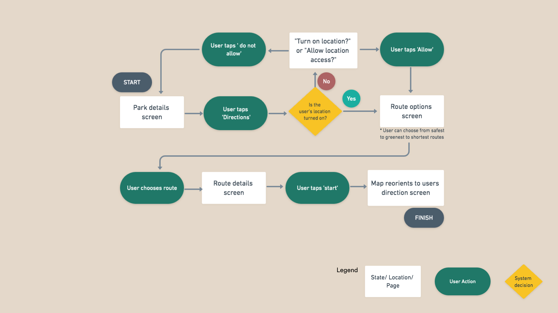
Secondary Task Flow diagram of selecting a route to the park
Sketches and Wireframes
Crafting the user's journey on the app
Once I was clear on the main task flow, I took to paper and pen to sketch out and explore the possible solutions. Referencing the UI inspiration board, existing features and components and looking at functionalities, we began producing our preliminary layout and interface lo-fidelity sketches.
In this scenario, Liza lands on the home page, searches for parks in her neighbourhood, sets her time preference on the slider, gets directions, and completes her walk to the park.
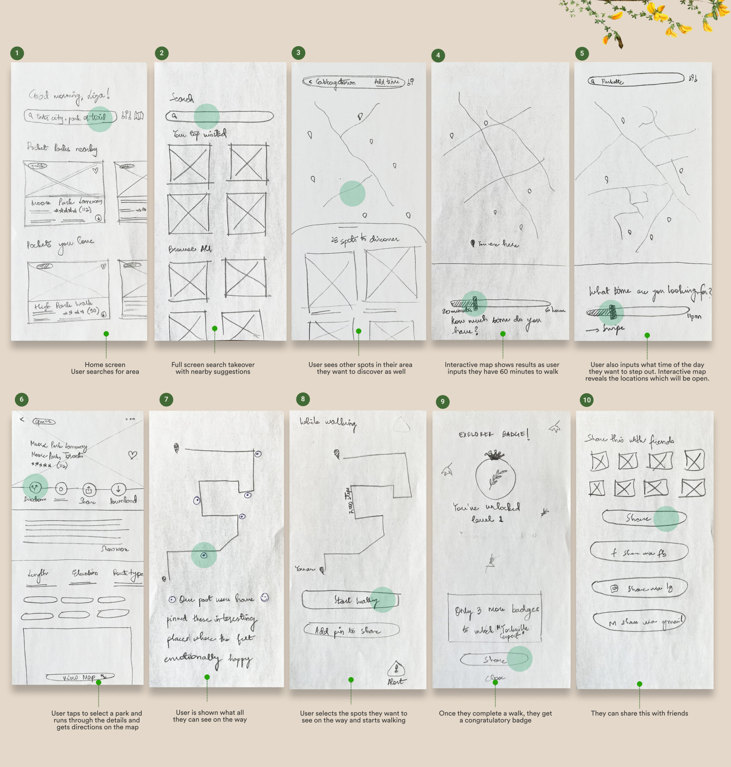
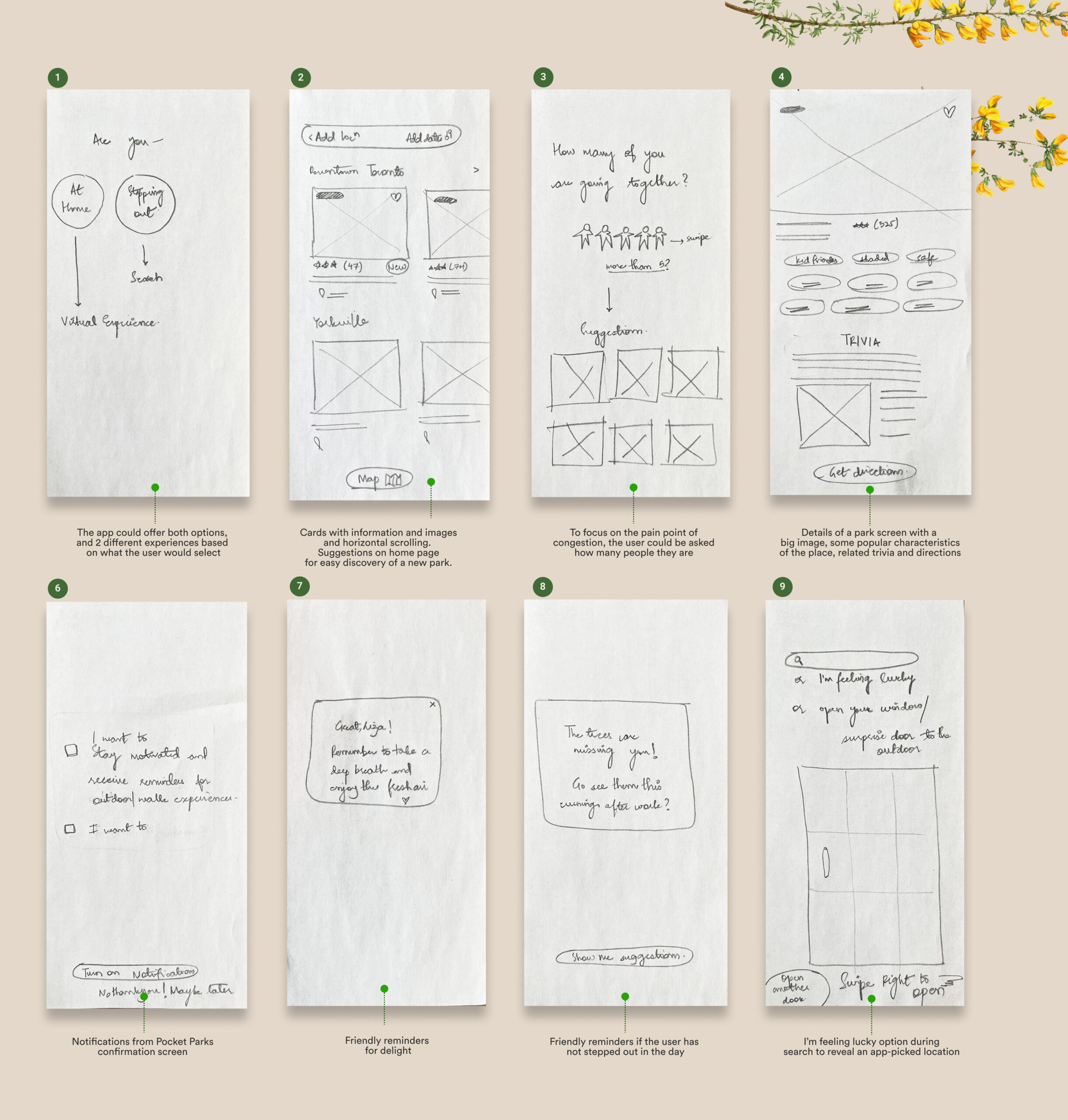
Pen and paper sketches for ideating the task flow visually
Prototype
Wireframes 1
Building out the task flows for our MVP
After concept sketches were completed, further refinement to the task flows was spearheaded through several rounds of user testing and feedback. This approach kept the design as user-focused as possible, and provided a rationale for any design changes and revisions.
The visual below captures key screens from the first digital wireframe, which was tested with 10 users over 2 rounds of usability testing.
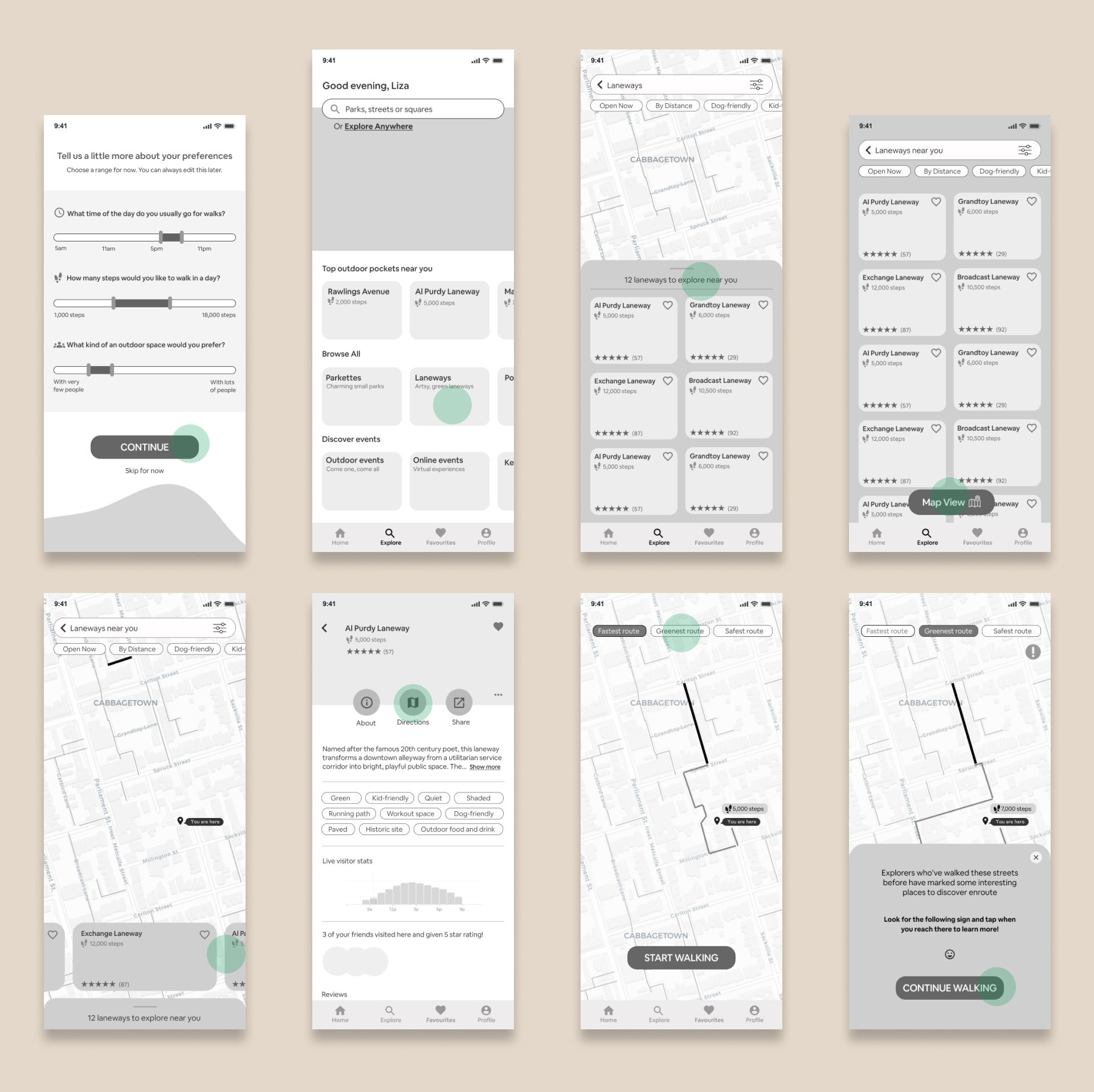
Key screens from wireframe 1
Test
User Testing - 2 Rounds
Test, test, test, incorporate
To test the functionality of our task flow and digital wireframe, we wanted to request some users to use the app, so that we may get a fresh perspective and check if users are able to perform desired tasks. All findings were recorded in detailed Sessions Output Documents.
To begin testing, all hotspots were removed from the prototype, and exit routes were built in. Users were recruited, and tasks were scripted to ensure the task flow was being tested completely. The feedback from testing was mapped on an effort/ impact priority matrix, and was incorporated before testing in the next round. It was important to understand what the users were doing, thinking and feeling to understand what parts of the app needed to be ironed out.
Usability Testing - Before and After comparison
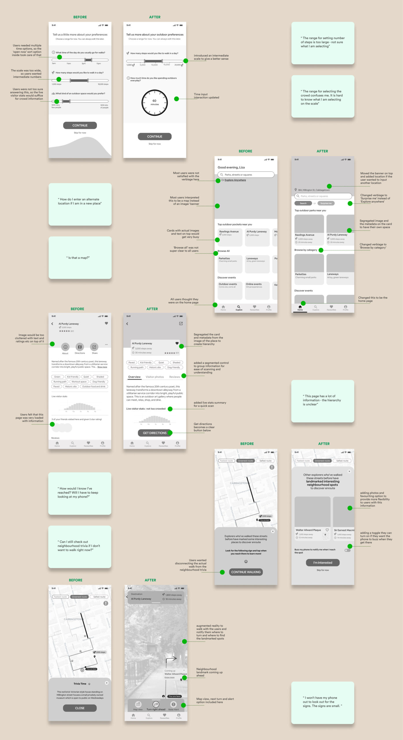
Refined wireframes

Iterating on wireframes post user testing
From the feedback I received in testing Round 1, design changes were made to the prototype. I took the next iteration of wireframes to Round 2 of usability testing and continued to iterate.
The visual below is the final wireflow after two rounds of usability testing which was used to design in high-fidelity.
This wireframe incorporated most suggestions from the priority matrix from Round 1 and Round 2 - however given that this is an iterative process, some feedback also came at the high fidelity level and was incorporated later.
Key screens of the refined low fidelity wireframe
Revise
Adjectives and More A than B list
Words that define the app's interface
With the final flow of screens established, I started thinking about the visual identity of the brand before creating the high-fidelity prototype. The following visual gathers a list of adjectives the brand embodies, and a more A than B list to help further define the UI.
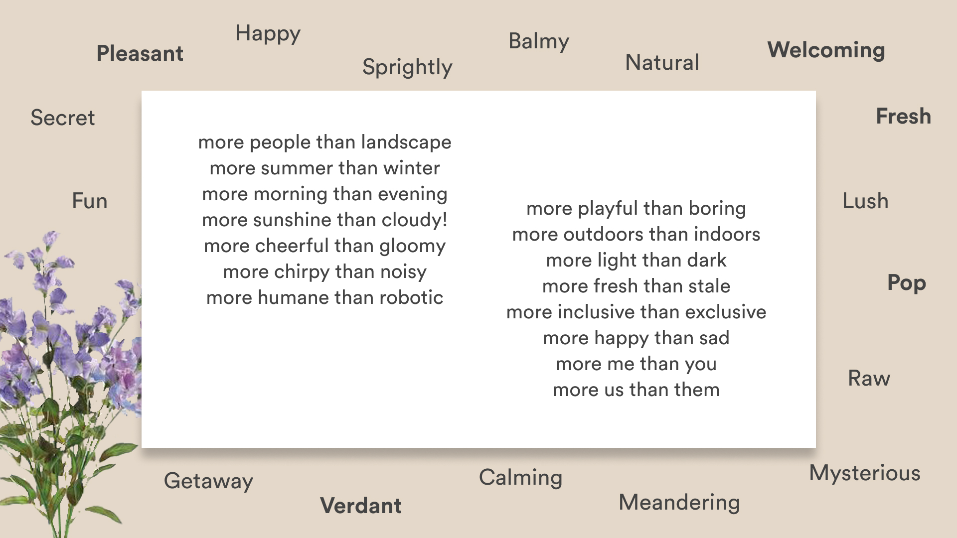
List of adjectives and a More A than B list
Moodboard
Evoking the (Pocket) Park feeling
The moodboard was driven from the words and adjectives identified in the previous section. Pocket Parks is a product that allows people to take breaks, walk away and outdoors for a while, and provides mental relief and relaxation. Colours like fresh greens and sunshine yellows instantly came to mind, as did Monet's landscapes, Henri Rousseau's paintings of the imaginary jungles, and the gardens and cosmos from the royal paintings of Jaipur or the Indian miniature paintings. The moodboard thus evoked pleasant, happy, sprightly, fresh feelings.
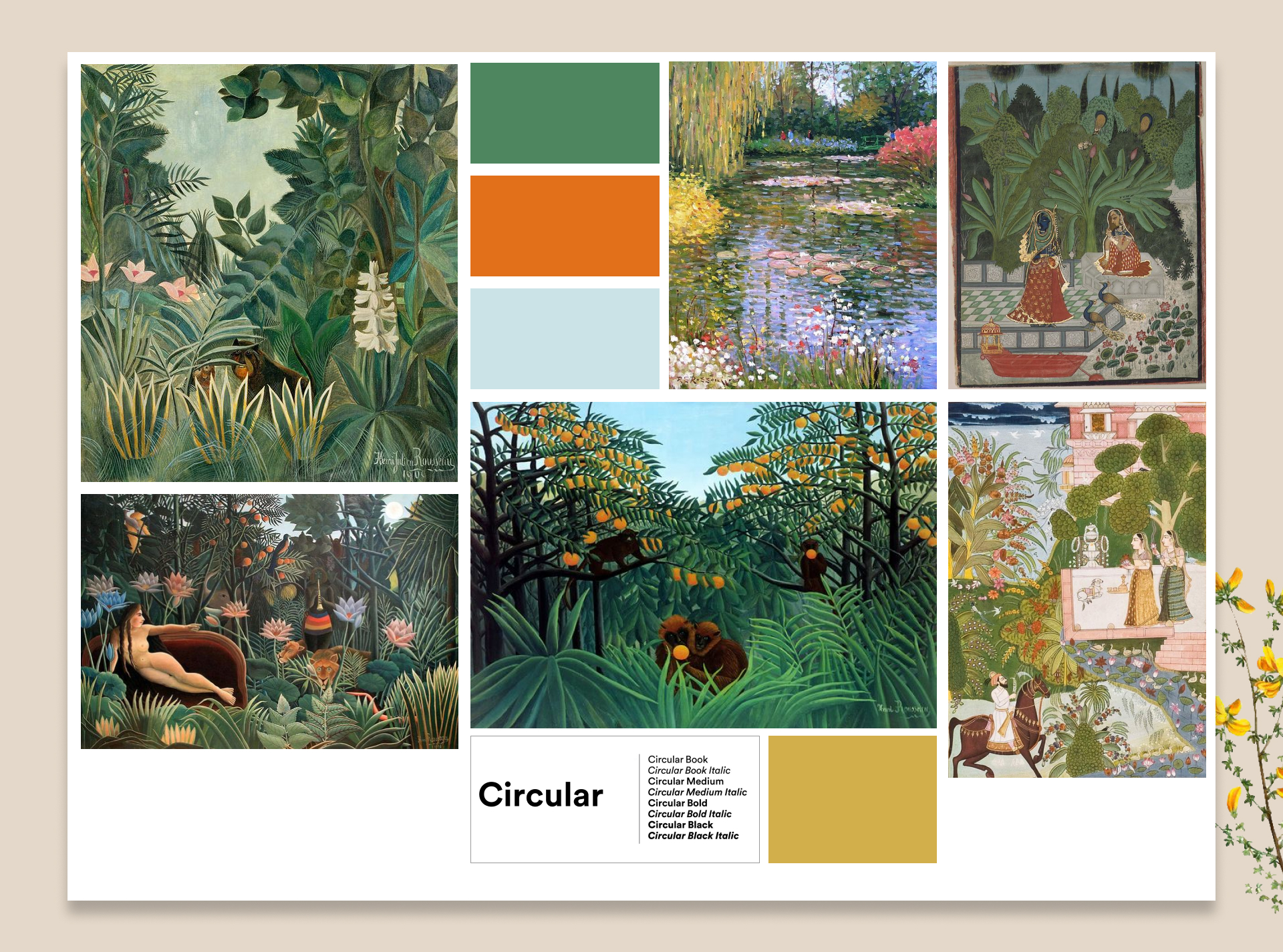
Moodboard for Pocket Parks
Colours and Typography
Defining the visual experience
For our brand colours, we took inspiration from the moodboard which consisted of lush green and pop Henri Rousseau paintings, deep shades from Indian miniature paintings, and landscape colours from Monet paintings. Pocket parks users are probably tired of looking at work screens and want to be outdoors. The type and colours had to be deep, earthy and clean for these reasons.
Pocket Parks' brand colours were fine tuned and Rousseau Green, Jaisalmer Yellow and Jodhpur blue were chosen as the primary brand colours. Neutral colours were extracted from the primary colour Rousseau Green, picked to provide contrast to the foundational UI elements. Four semantic colours or feedback colours were identified and fine tuned for this overall palette.
The brand font used on all screens is Circular Std., a clean, fuss-free, modern sans serif font. The spacious kerning and clean, simple shapes help present the information in the app in an unobtrusive and legible way. The choice is also considering people are taking a breather, and easy, simple visual identities will appeal to them.
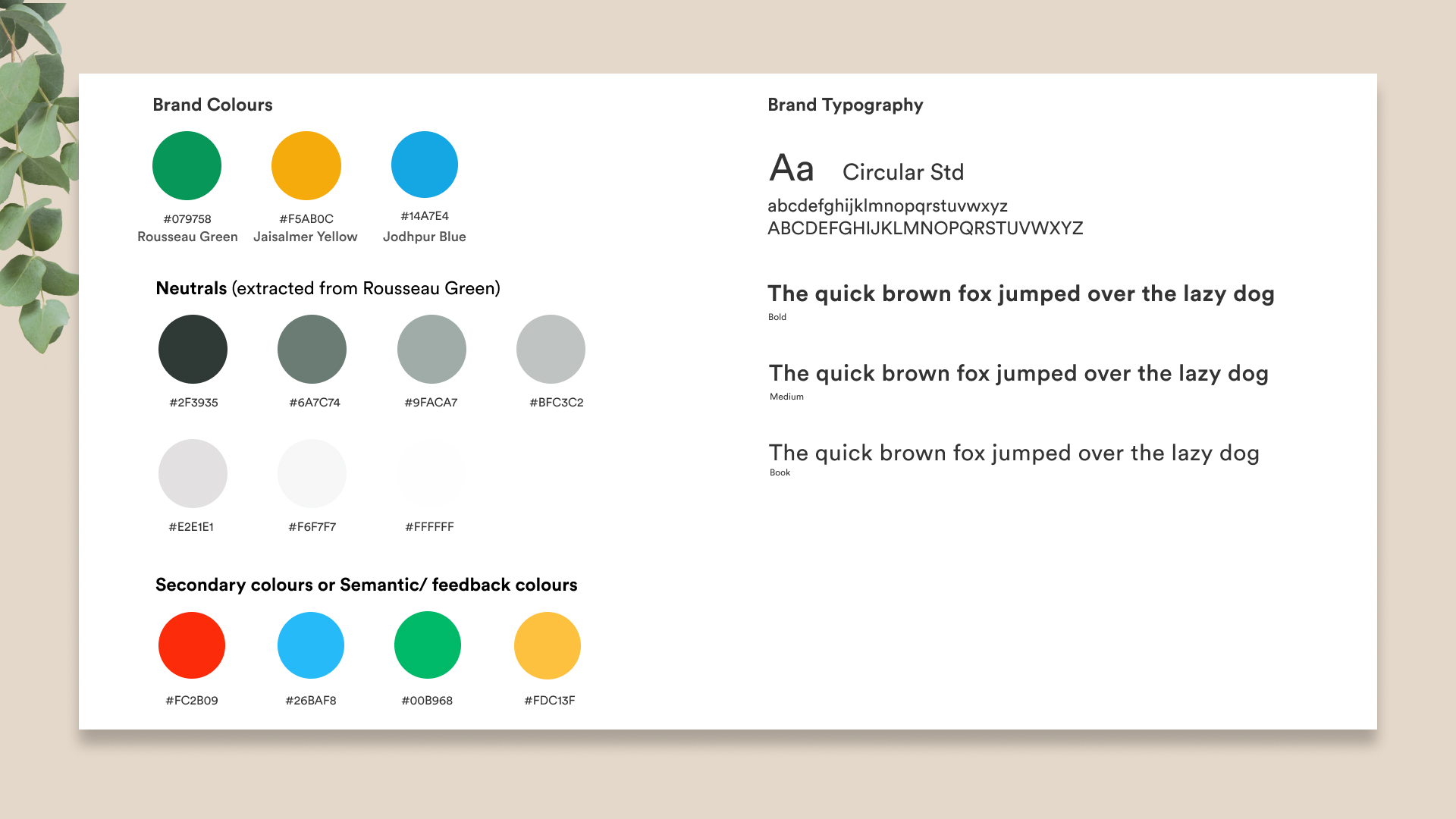
Brand colours and brand typography
Wordmark and App icon development
Clear and visually memorable identity
In order to develop a clear and memorable identity for the user, two approaches were tested out - one was to play on the word pocket by creating pockets within the alphabets to suggest carving space, inspired by a sculpture pavilion plan. Two, to integrate organic forms into the wordmark and icon, to suggest lush and life - words that focus on the pain points of the user directly.
Different sans serif and serif fonts were tested in different sizes, weights, spacings, and styles to look for the right feel for the brand. Finally, the very clean, modern, sans serif font Circular Std. was picked to develop the wordmark further. The final wordmark shape was determined with the assistance of peer testing & feedback.
The inspiration for the app logo design came from incorporating elements from the wordmark, and aimed to be a symbol that denotes a tree, leaves and mostly, sunny outdoors.
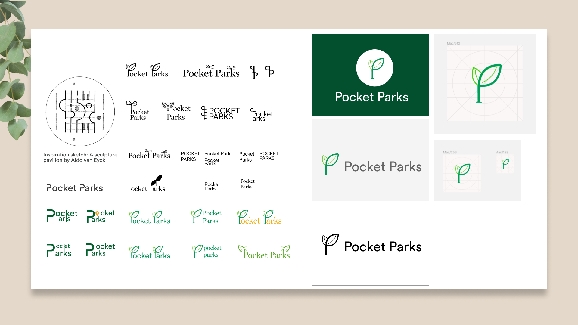
Developing the app wordmark
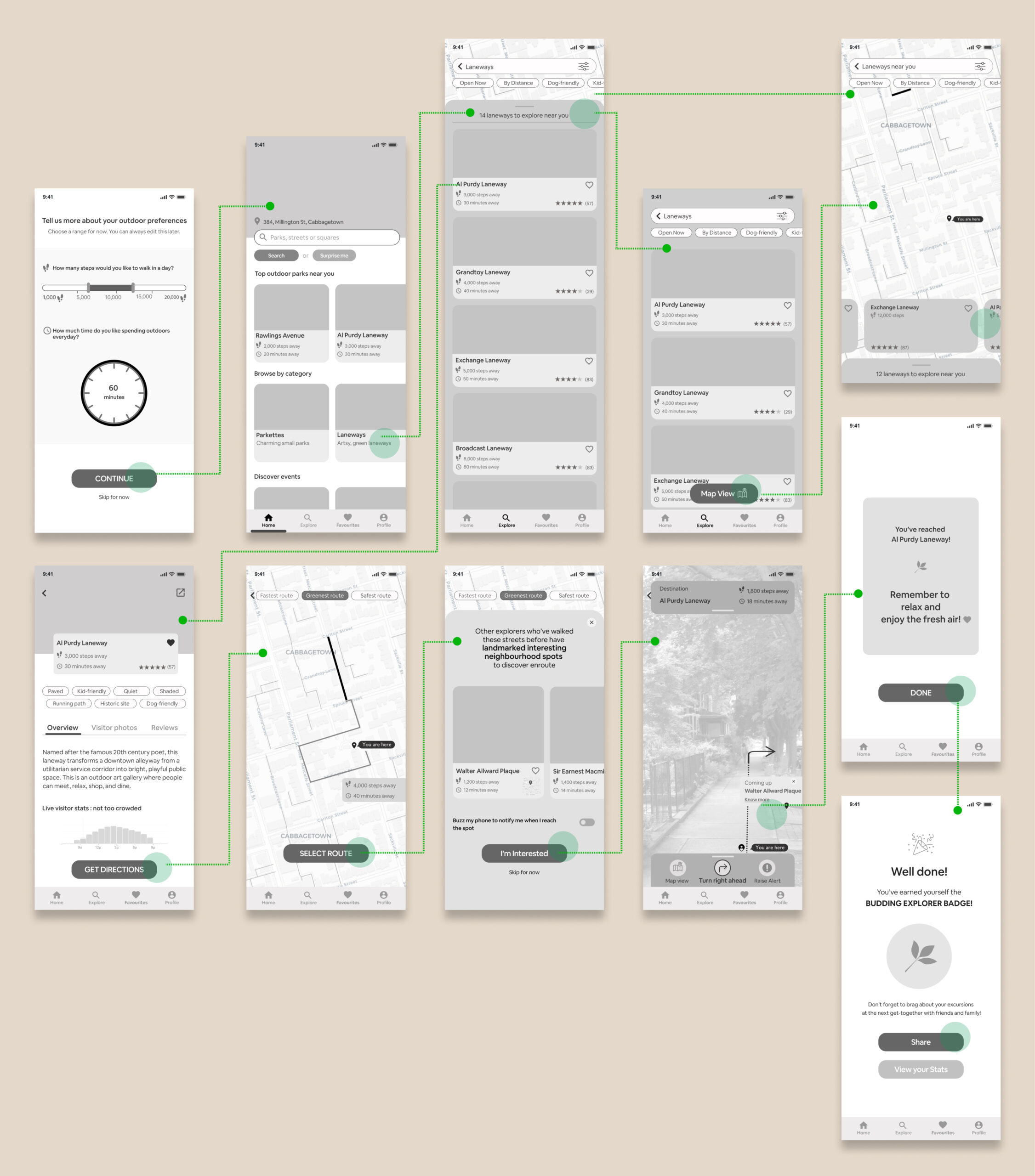
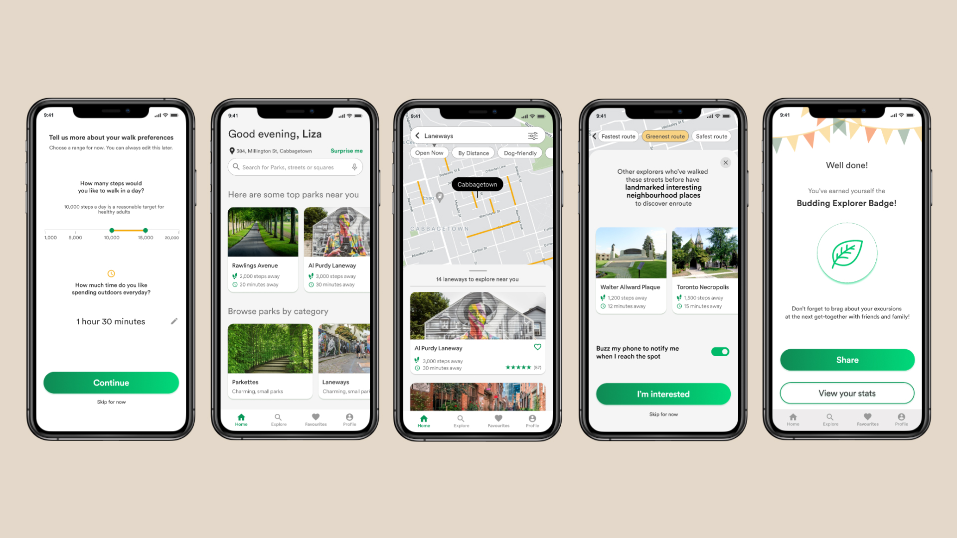
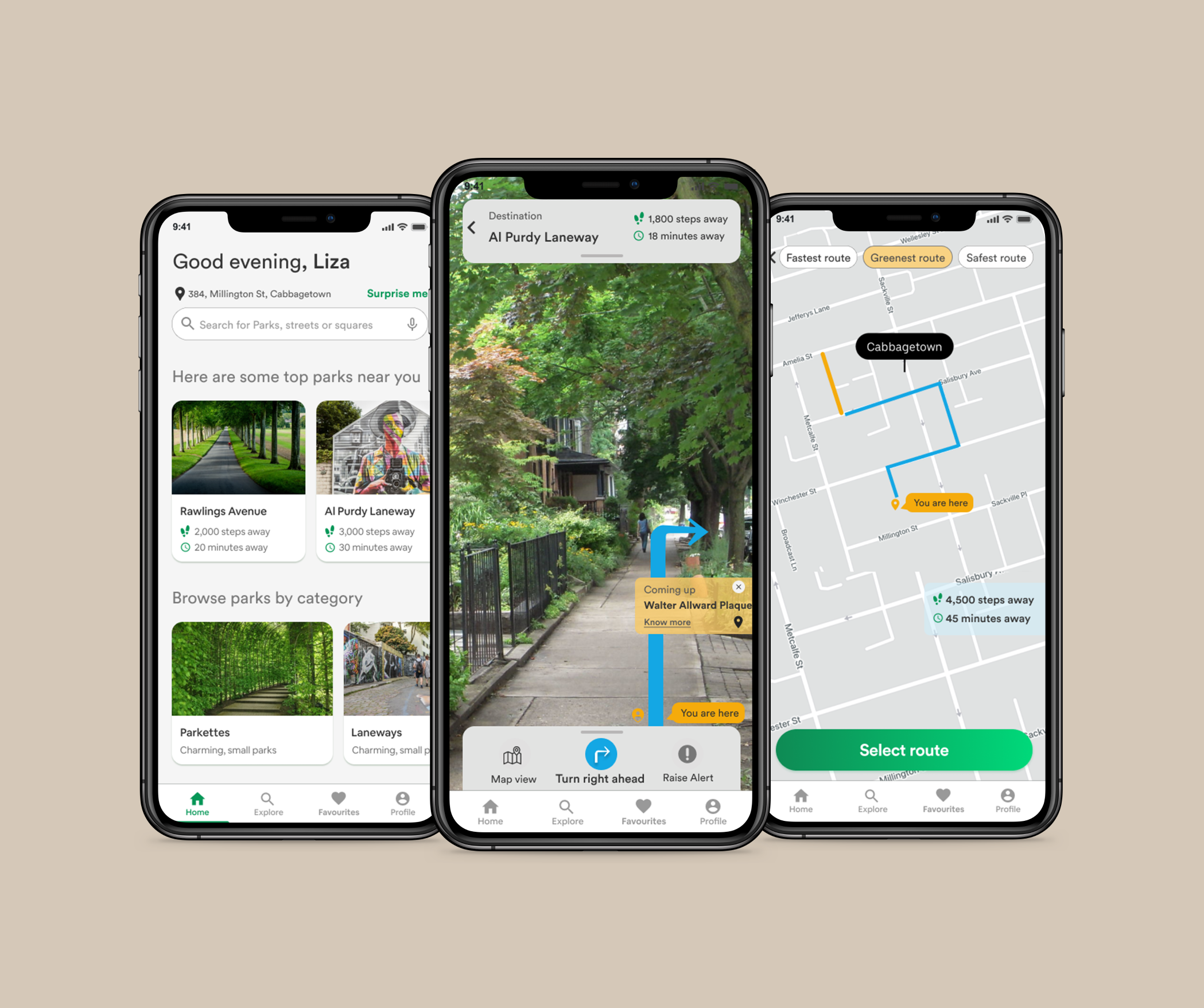
High fidelity prototype
Simulating actual user interface
After usability testing sessions, and consolidating feedback, and based off of the brand identity. I designed the high-fidelity designs for the product.
Making the high fidelity prototype was not just an activity in visual identity or colour injection, but rather another opportunity to loop in some the next steps from the usability testing feedback. For instance, I referred to Human Interface Guidelines for iOS and added a time picker for setting walk time, as against the circular touch interaction which may not be ergonometric or efficient as the picker. I also added segmented pill controls to the park details screen in line with Jacob's law of UX design which acknowledges familiar mental models of the target demographic of users.
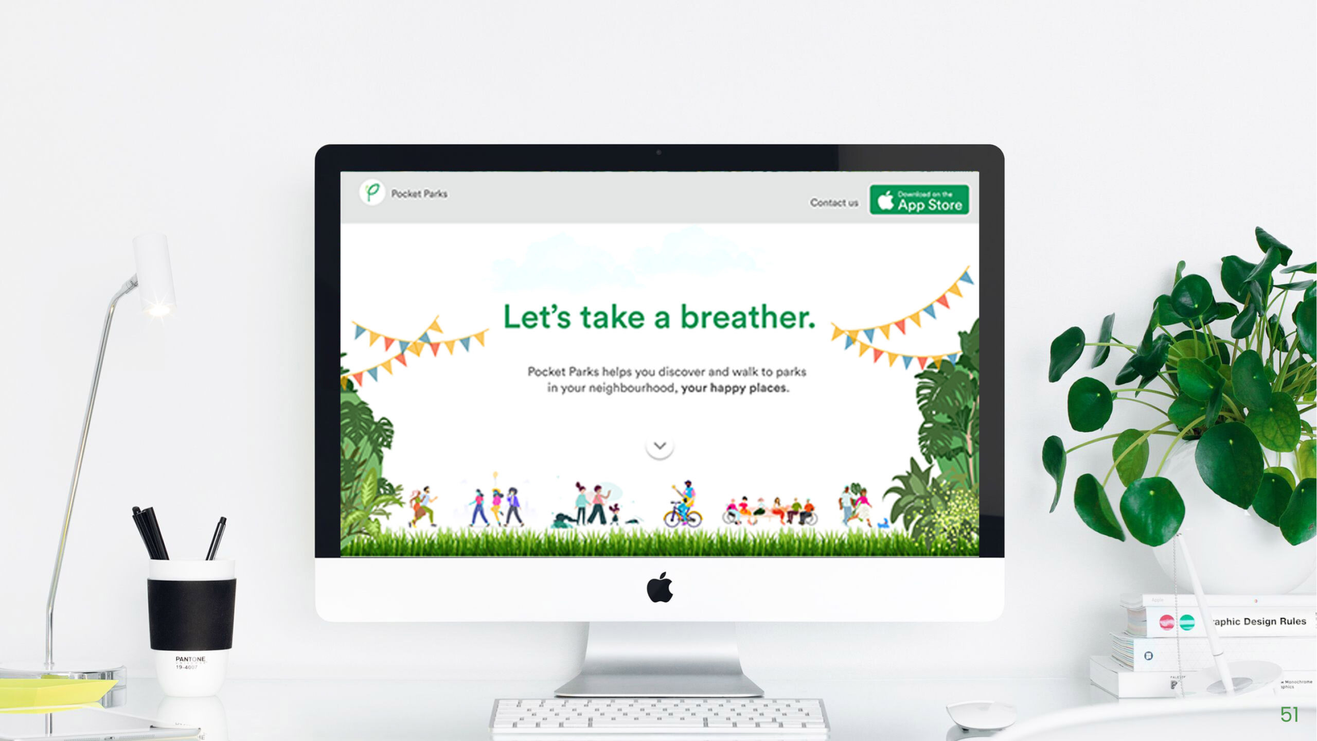
Marketing Website
Marketing Website
Marketing Pocket Parks
Having designed the product from end to end, a hypothetical marketing website was developed to promote Pocket Parks app and its features. One of the initial means by which a user may discover and download Pocket Parks is through our product’s marketing website. This was an opportunity to establish and develop the product’s brand voice, and key brand narrative for our Capstone product offering.
Similar to the mobile prototype design, ideation was taken from paper sketches and low fidelity wireframes to high fidelity through several iterations and rounds of user feedback.
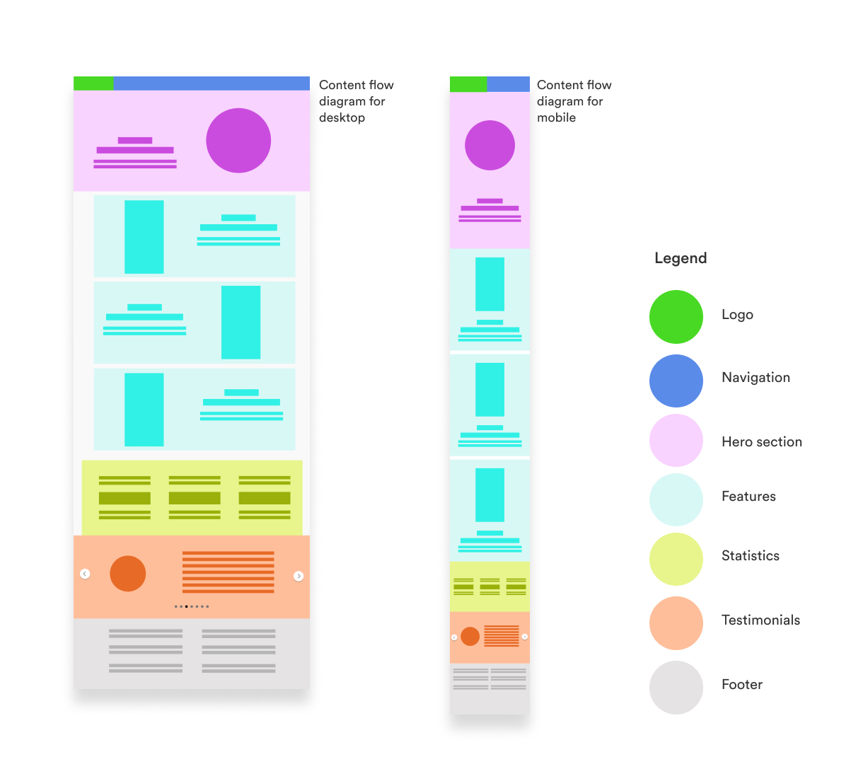
The desktop website was developed with a 12-column, 1180px max width fluid and fixed grid system, while the mobile website was developed with a 4-column 16px margin and gutter, at variable width.
Click on the links below to view the full marketing website prototype, as well as the InVision inspiration board curated for the marketing website design.
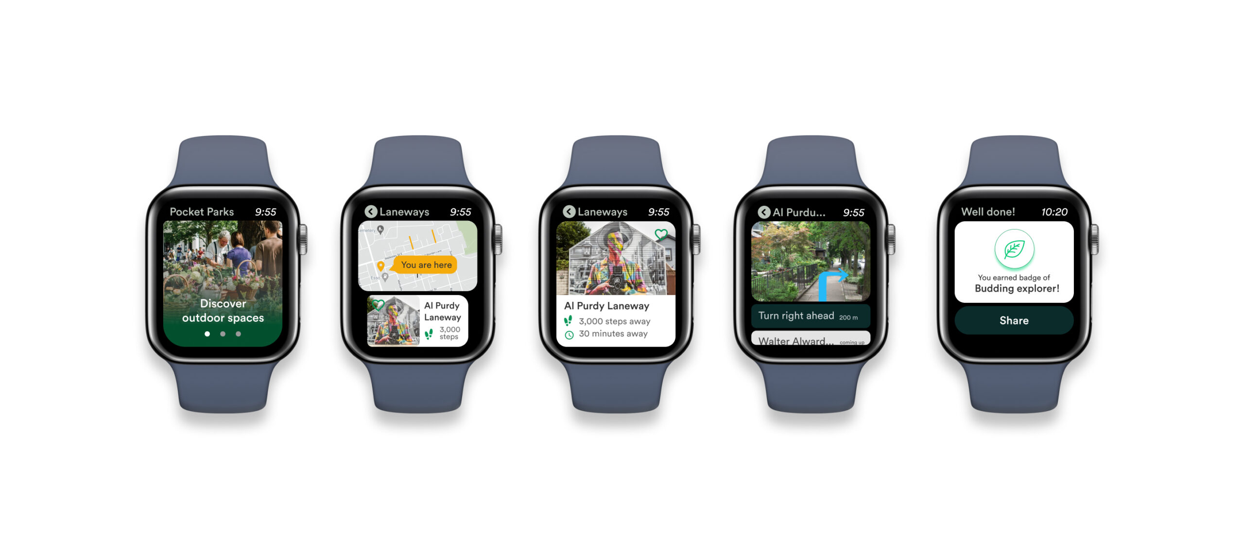
Multiplatform design
Multiplatform challenge
Alternate physical modes of interaction
As an exploration of various other platforms the app can be used on, the interface was envisioned to be integrated within an Apple Watch. The app Pocket Parks is imagined as being used to discover places within the neighbourhood and the context is most likely when people are wanting to step out, or possibly they are outdoors and have time to spend. Smaller and more portable devices will provide more opportunity for engagement.
In the example flow below, the user onboards and can swipe to see parks in the neighbourhood. The strapped-on watch guides them through the walk, a haptic feedback can tell them when a landmark is coming up and notify when they reach - making the walking experience more natural and less intervened by devices.
Long term product impact and future
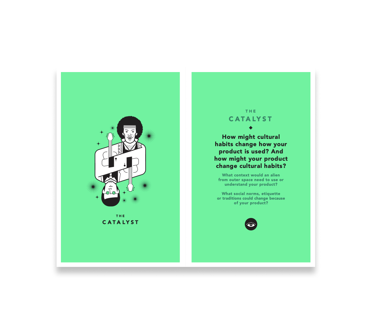
Tarot Cards of Tech
Thinking of future impact of product
In order to think of the future impact of Pocket Parks and picture potential outcomes, unintended consequences and opportunities of the future, I randomly picked 'The Catalyst' card from the Tarot cards of Tech.
With the pandemic and work-from-home situation prevailing at the moment, shorter and closer escapes are becoming crucial to people. Pocket Parks encourages taking breathers and breaks, and highlights the importance of the outdoors for overall well-being. It also helps create a sense of belonging, because urban centres are seeped in history, but people moving into cities can never know unless they take efforts! Culturally, Pocket Parks will encourage a culture of neighbourhood walks, meeting people and building connections with community.
People who own land parcels or any semi-open/ open space might be encouraged to think of ways they can allow other people to transgress and claim space for certain amounts of time, thus helping in creation of newer pockets as well as potential business opportunities.
Next steps and Key learnings
Reflecting on the project
Next steps and key learnings
The experience of this end-to-end process has come with learnings at each stage. The most important of these has been building conviction in the idea of the product as one proceeds working with it, and rooting design decisions in user research. Each time I found myself in a cloud of hazy thoughts, going back to the user insights gave me clarity to move forward. Looping in user interview insights and user feedback has only make the product better going forward.
From previous design education, I have always valued the iterative process. The most important thing is to start sketching out ideas, and then coming back to them and iterating. The UX process was no different - each layer of information is a trace that one adds on to the canvas - and these layers of iteration add nuance to the final product. Keeping the user at the centre of these ideas has been a crucial learning.
A key learning has been breaking down the UX process into moments of experience for the user - moments where the user discovers something, moments that engage the user and moments in the experience that bring surprise and delight - all need to be deeply designed for the user to build a relationship with the product.
In terms of next steps, as large urban centres get denser, future cities might see more flexible use of the same space, and a putting people first approach in the form of smaller chunks of open space - these will be micro-environments, perhaps even transitory and temporal - and the app will have to integrate data to capture these. Another important future step is integration of emerging technologies - augmented reality (AR) to help the user discover their neighbourhoods and virtual reality (VR) to help users attend and visit local events and parks virtually.
A third important next step is to increase accessibility to a way larger audience and think about how people can experience these even if they cannot physically be at the parks. Safety and privacy, since the app is location-based, also demand clear considerations.
There's a lot of possible directions for taking the project further, and I'm excited for what discoverability of and engagement with neighbourhood open spaces in urban centres looks like, and how these help create a sense of belonging and making home in cities.
Selected Works
We Score Design SprintProject type
Pocket ParksProject type
Costco UI RedesignProject type
Cloak by MastercardProject type